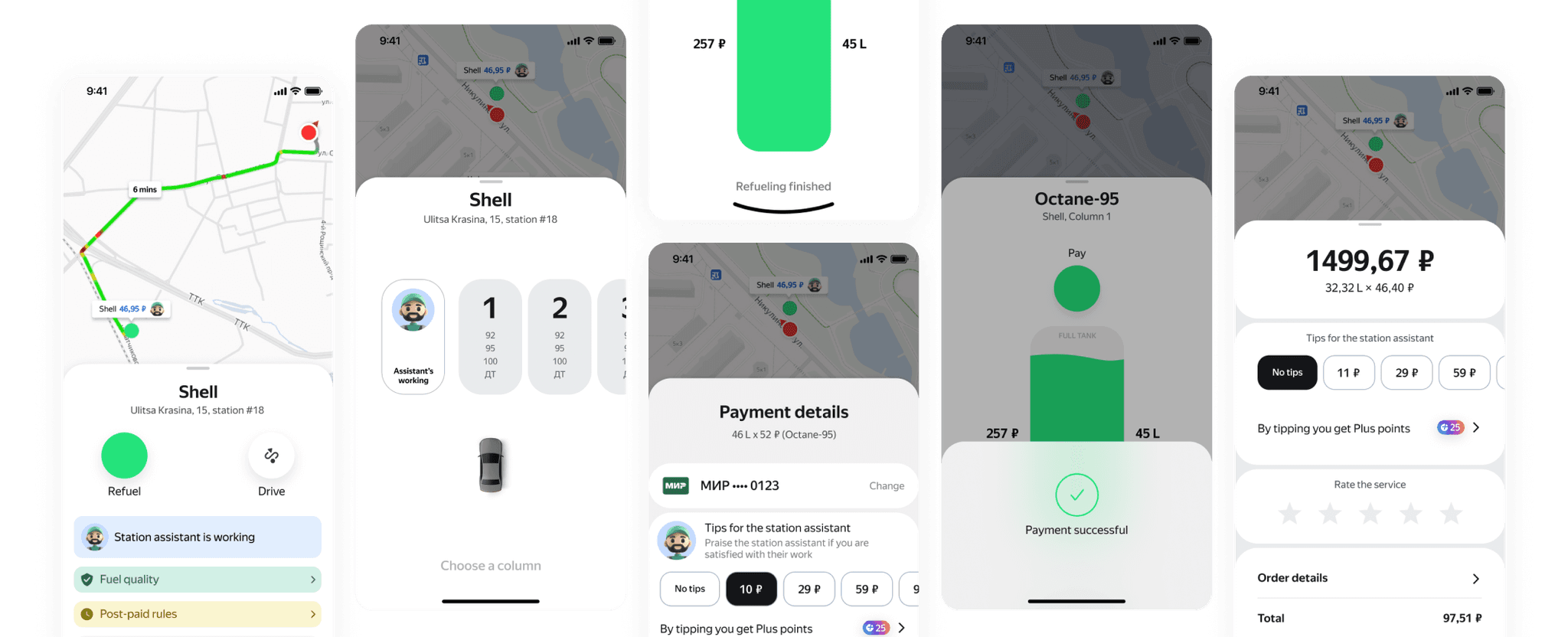
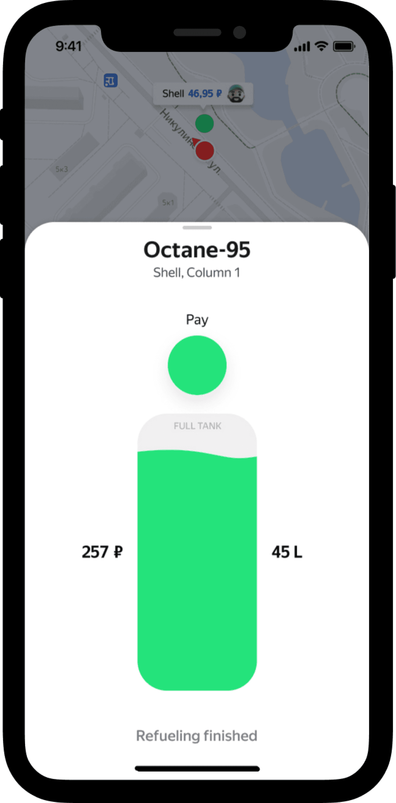
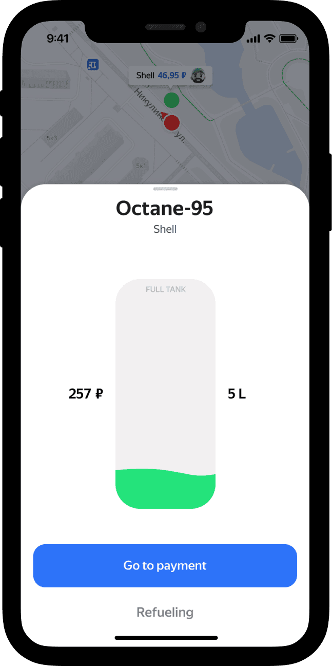
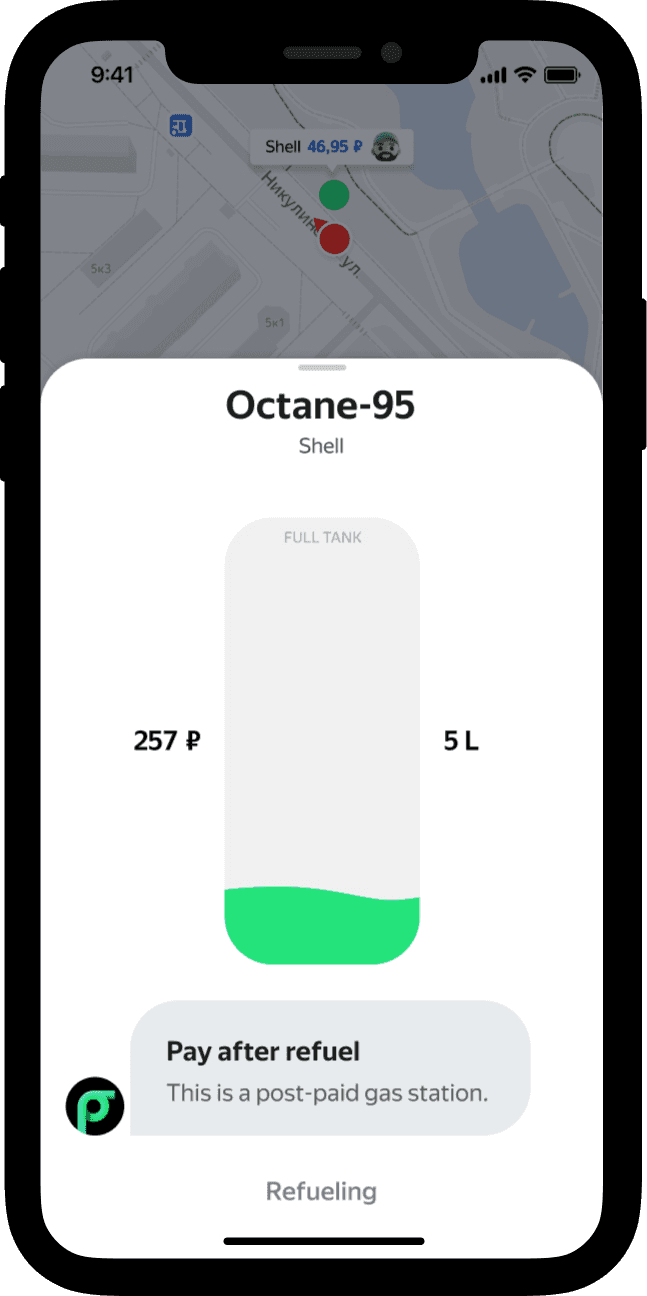
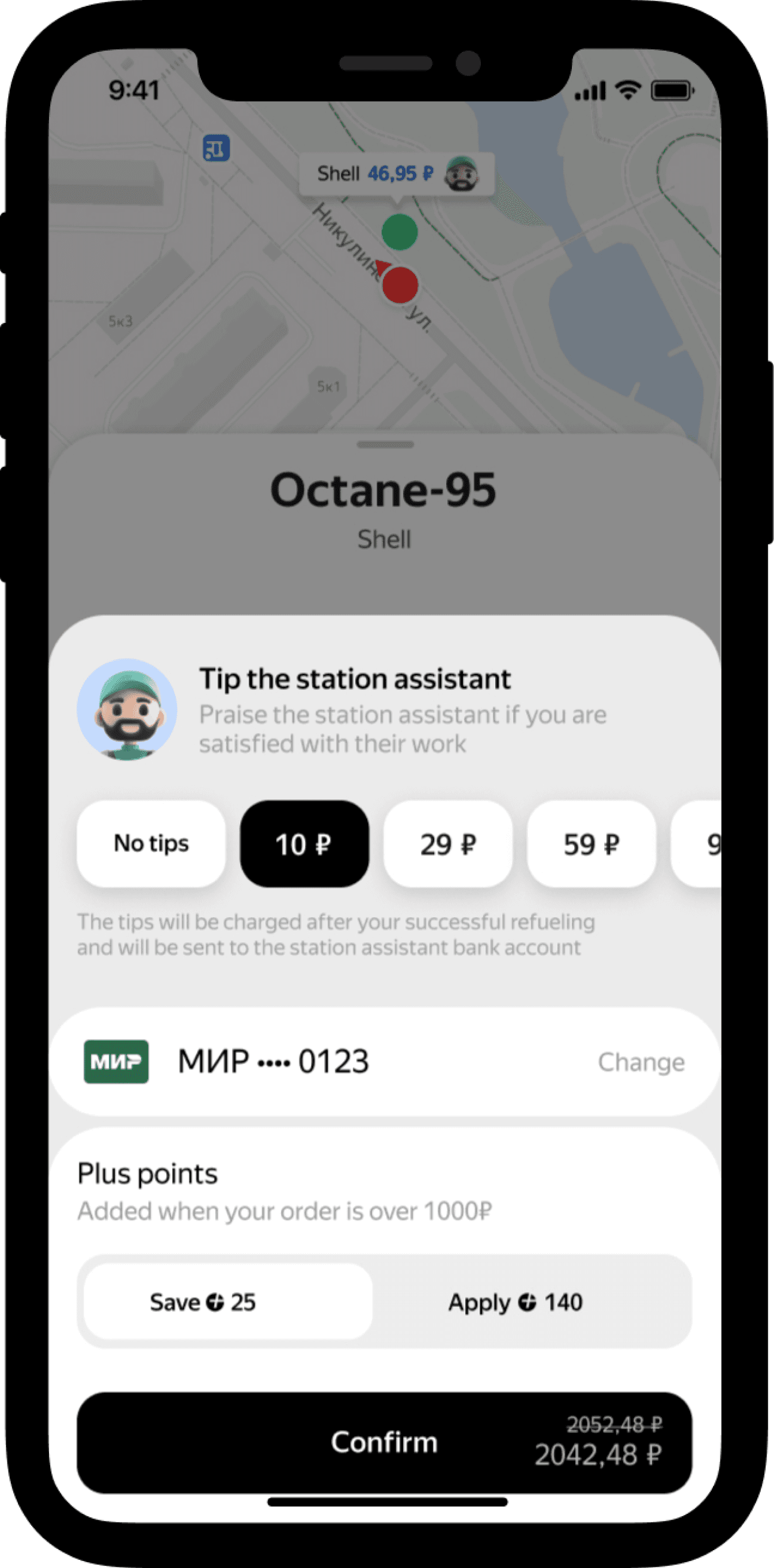
Problem
Users didn’t pay for the fuel at post-paid gas stations and left.
The stations' workers filed police reports on them.
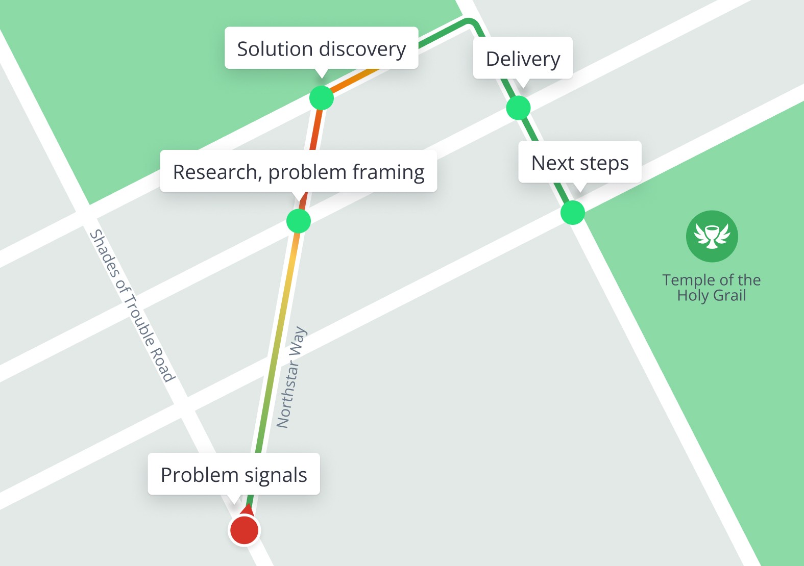
Problem signals
The problem began manifesting in April 2023. According to product analytics, there have been approximately 1,000 cases (less than 1% of the total) over the last 30 days (as of June 1st).
Negative outcomes
— Lost revenue
— Costs from refunding the stations
— Brand reputation damage
— Customer support overload
— Users have to deal with the police
The business goal
To reduce the rate of such no-pay cases to 0%.
My role ⌘ + ...
Context
Target audience
Key metrics
Monetization
Key partners
Main Use Case
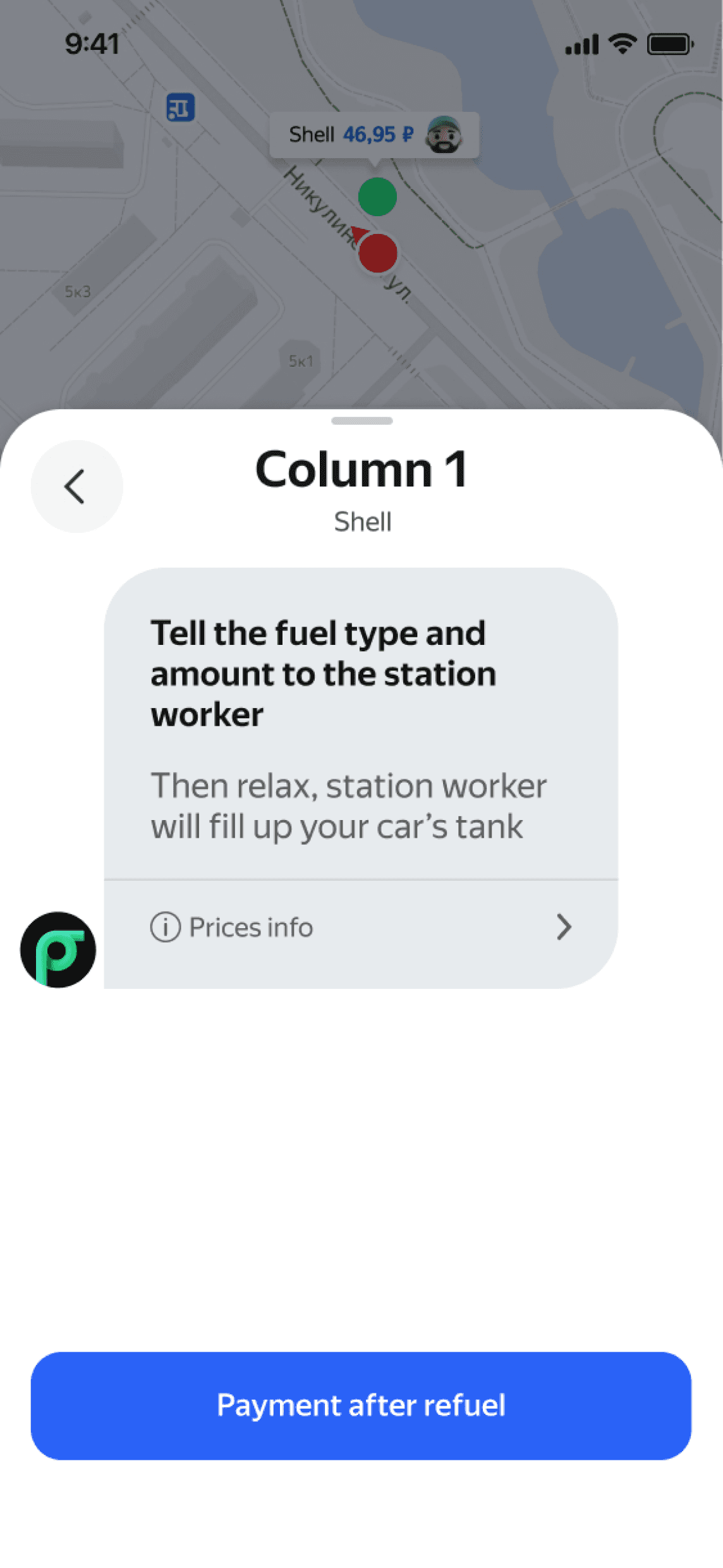
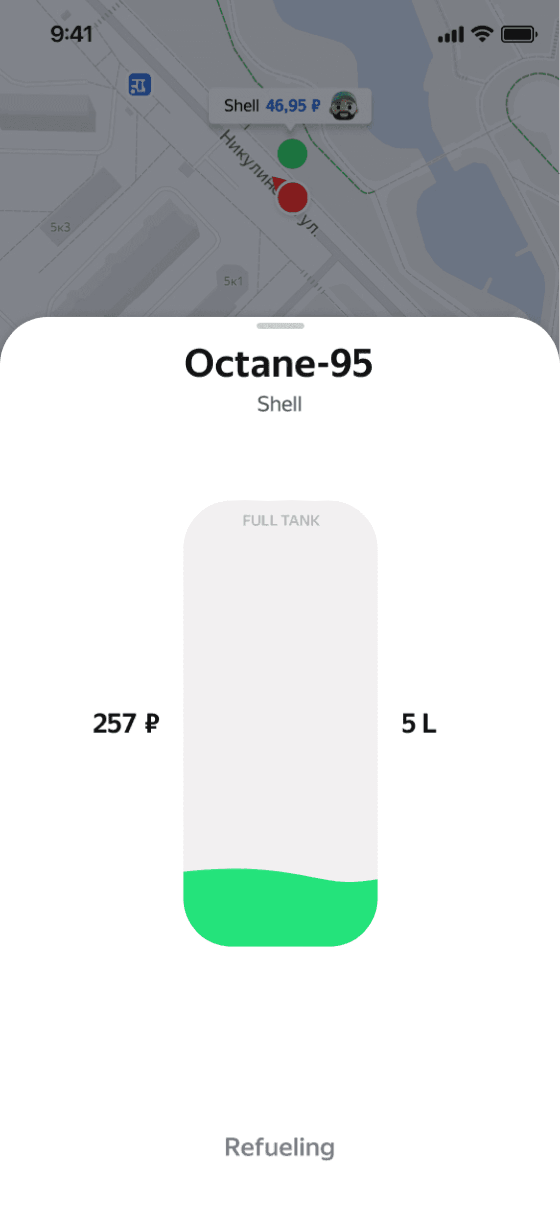
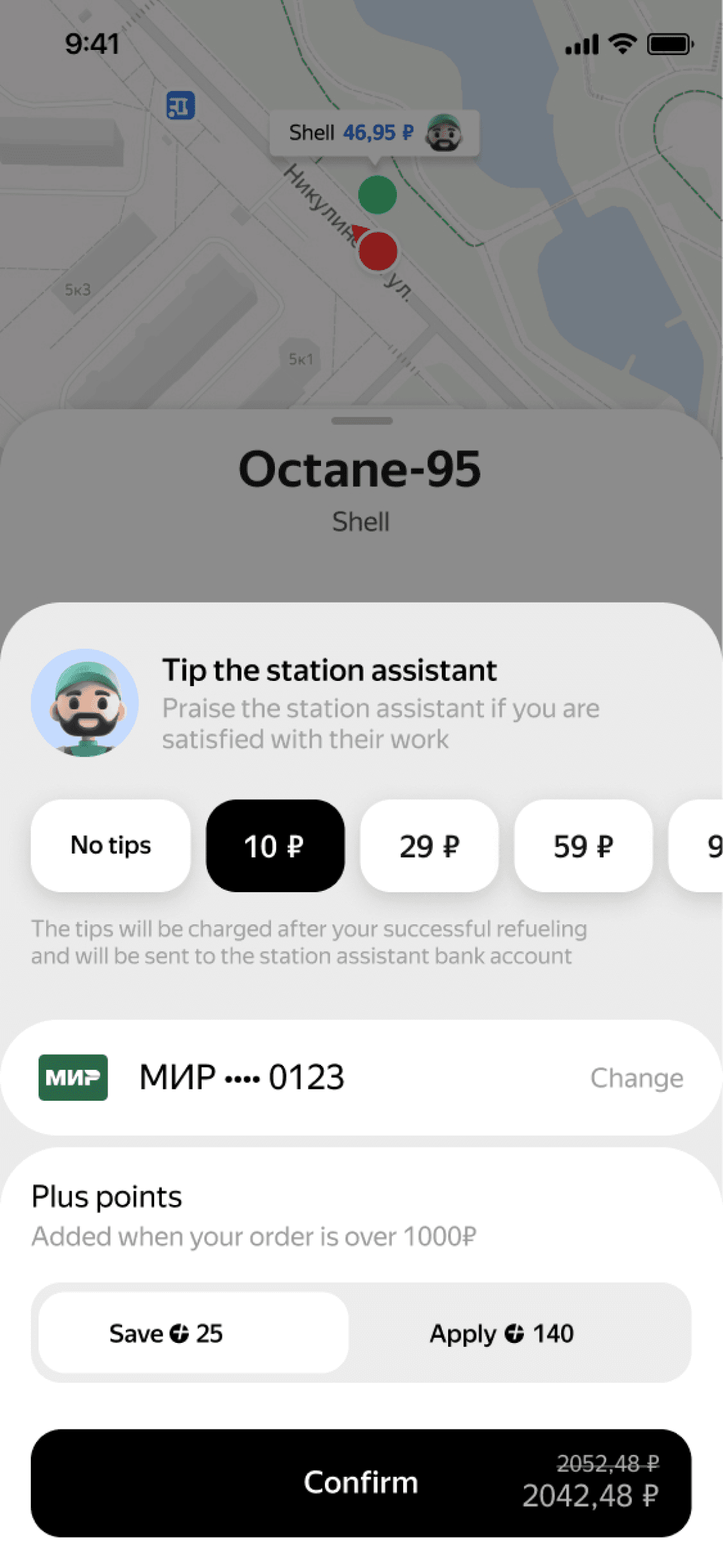
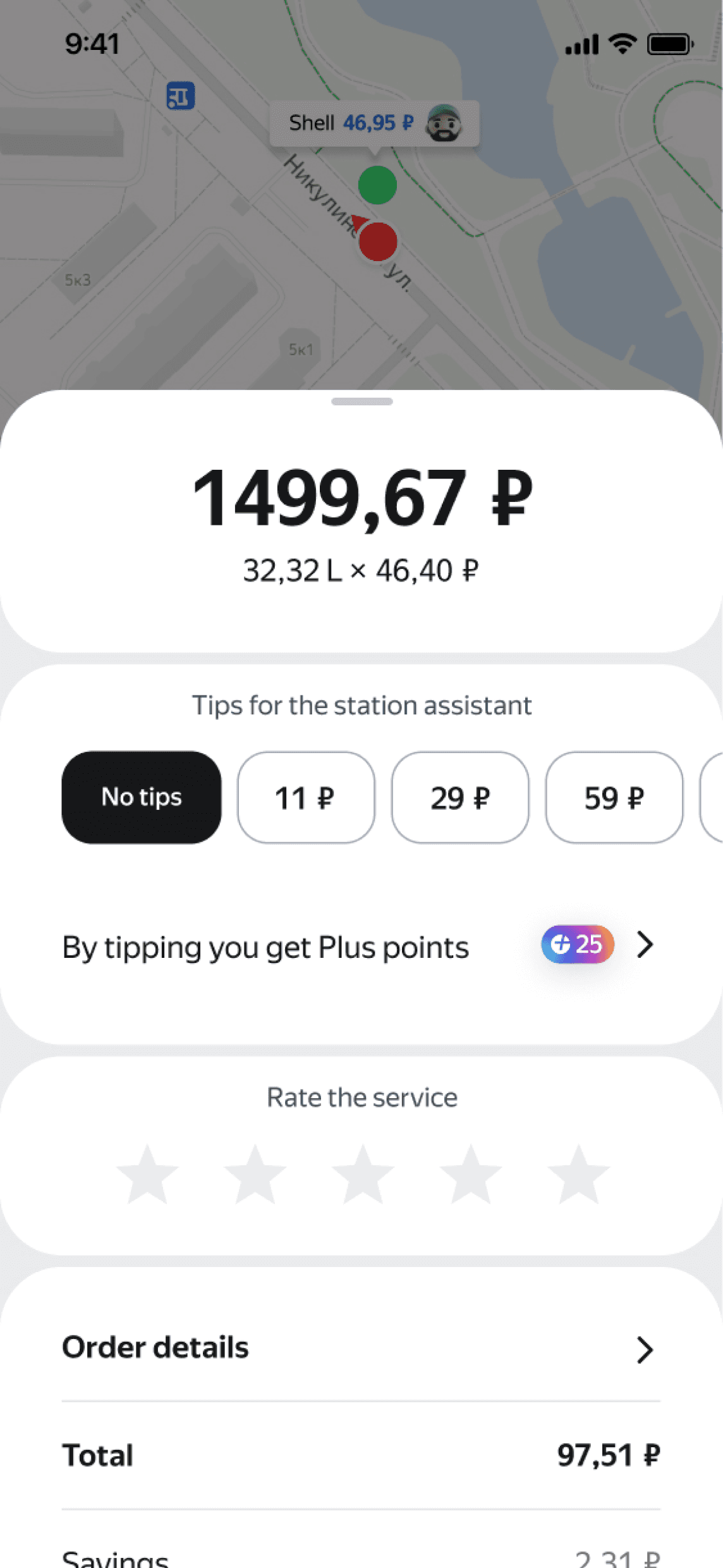
People use the service to pay for fuel and skip checkout lines.
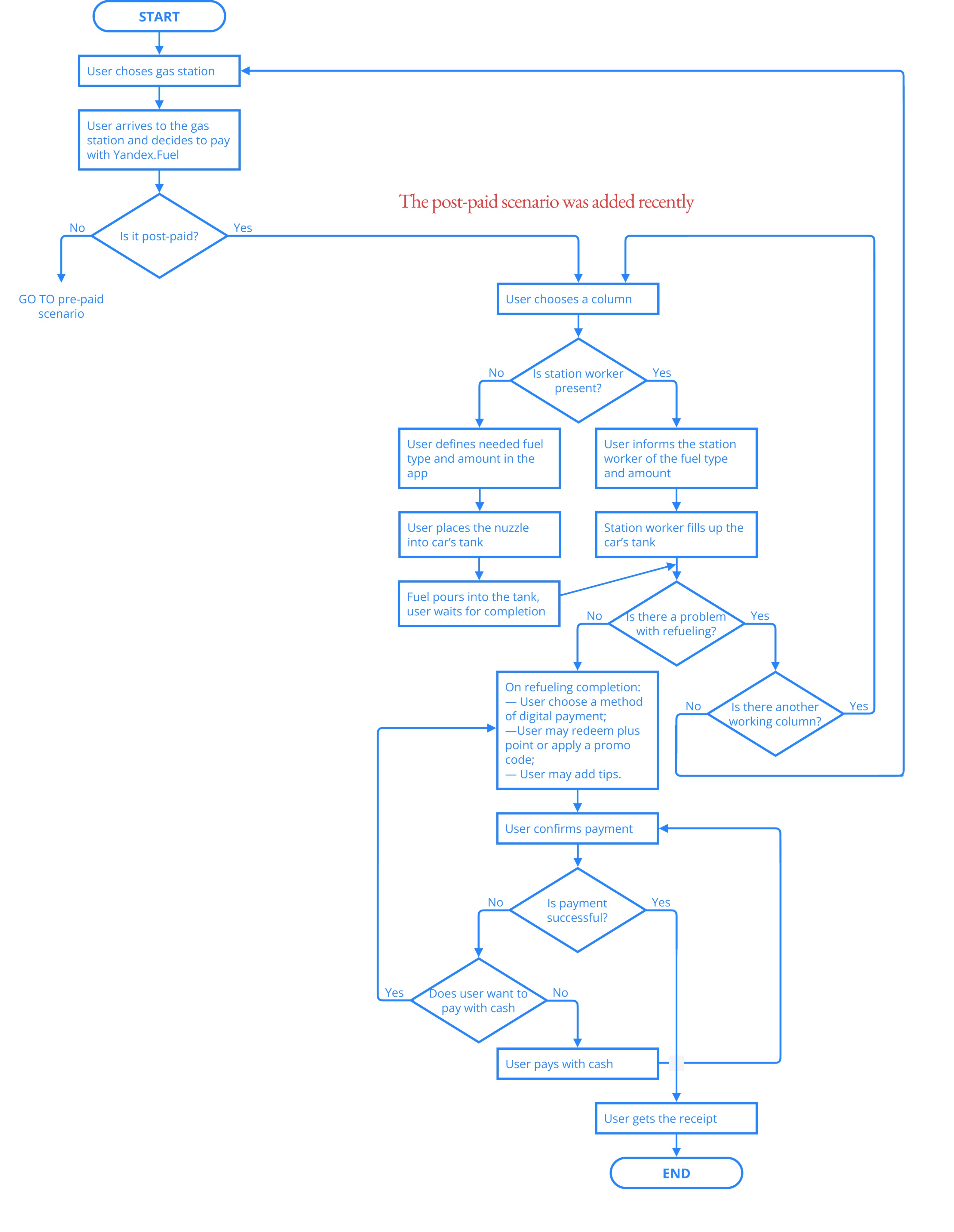
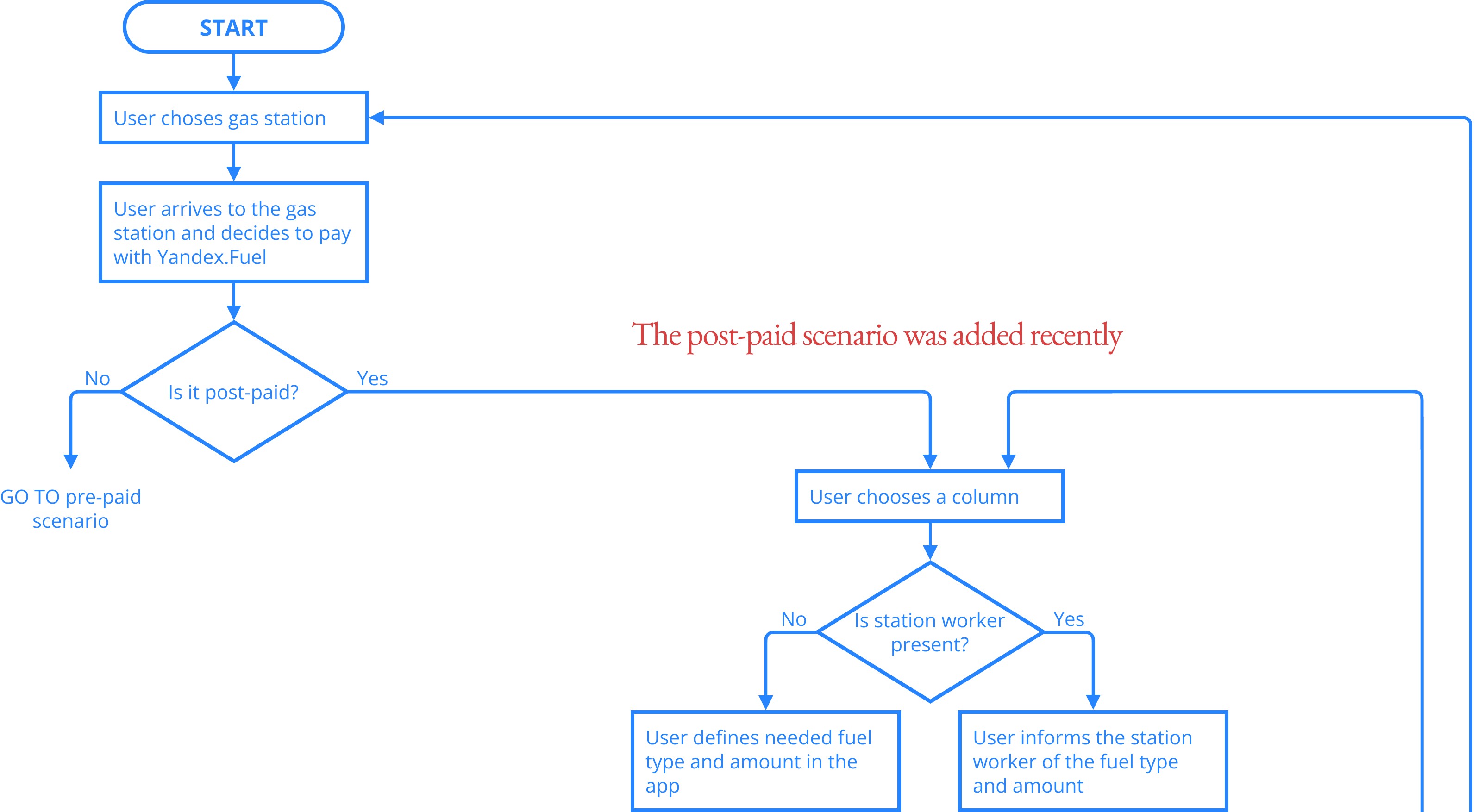
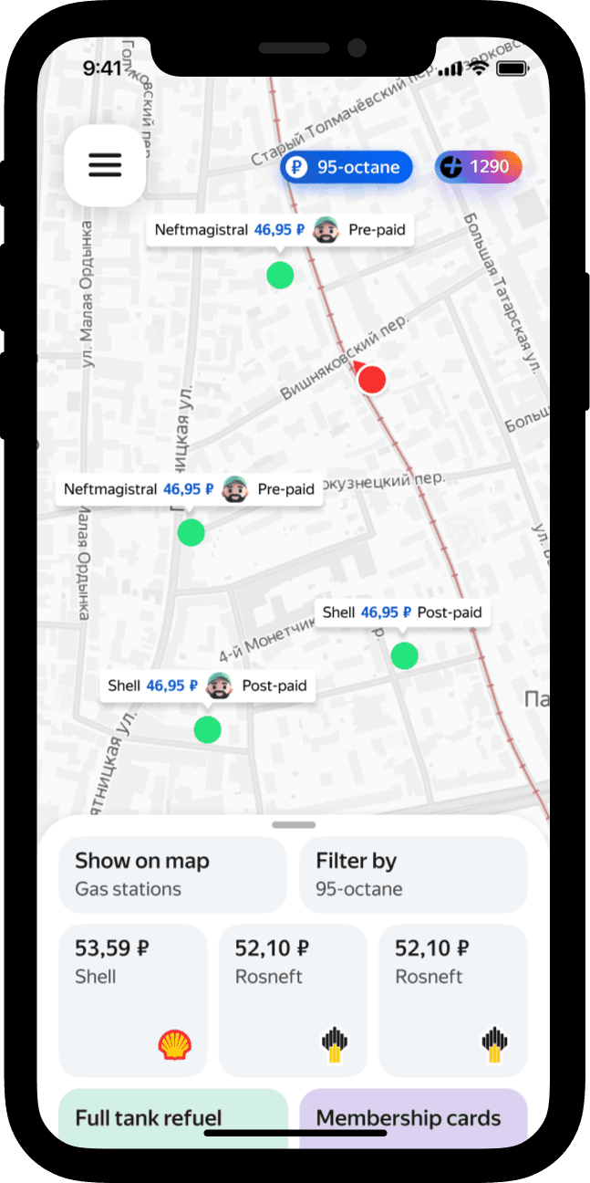
The post-paid scenario was added recently, in April 2023.
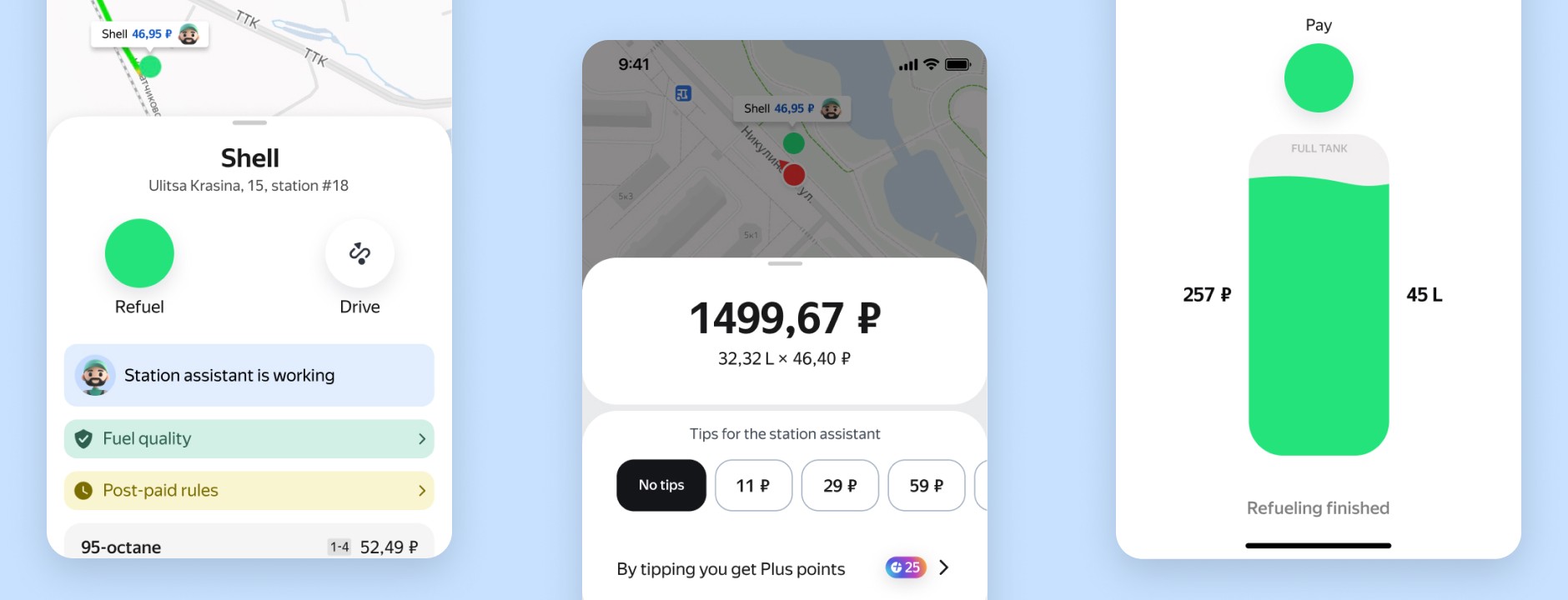
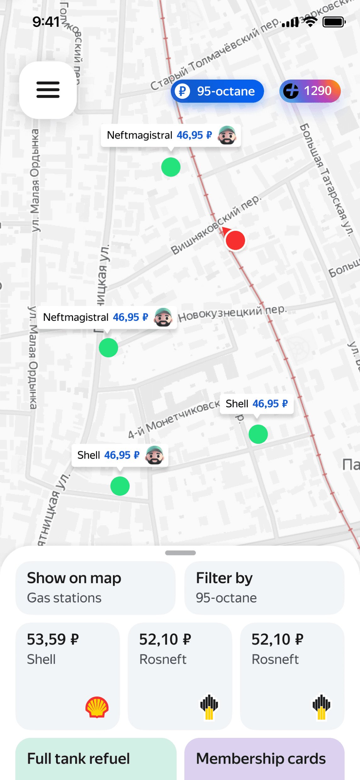
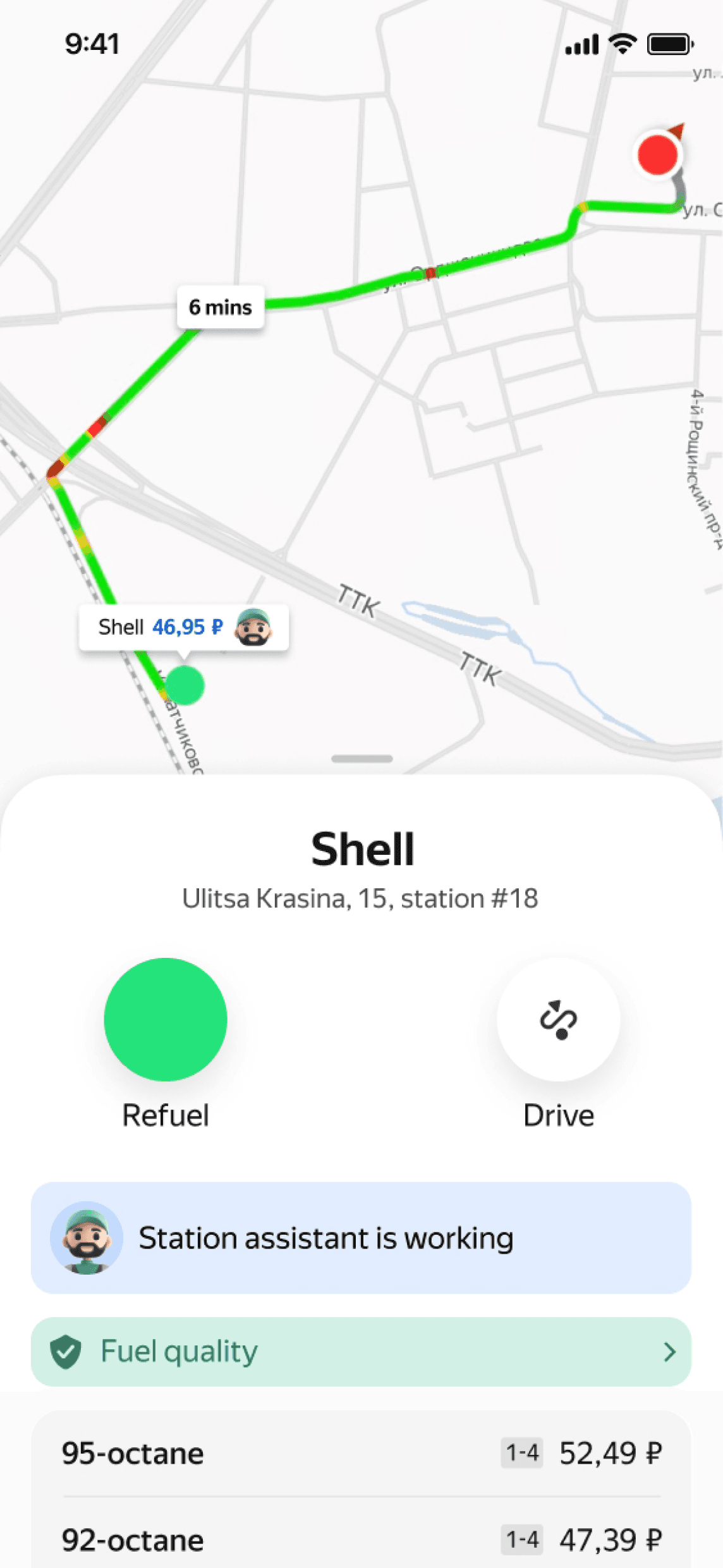
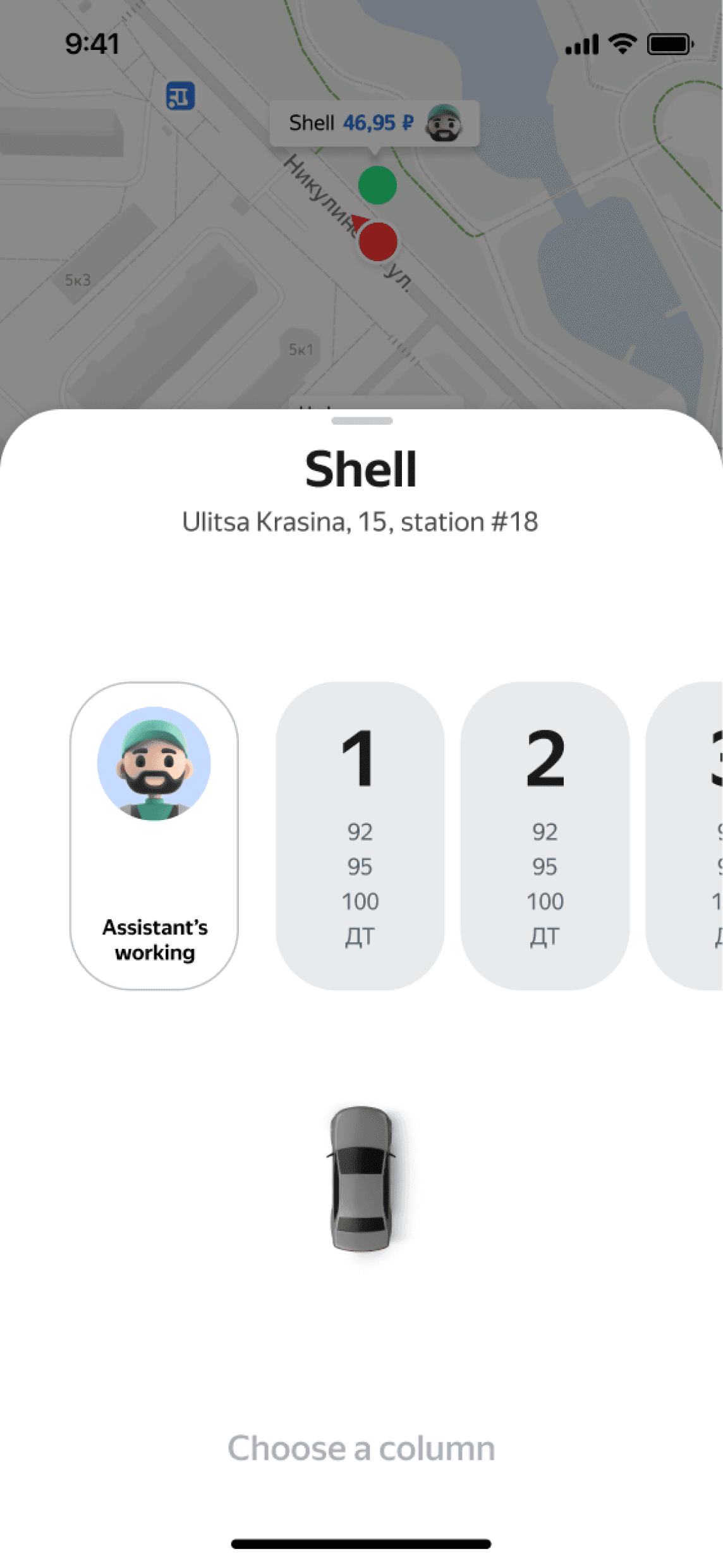
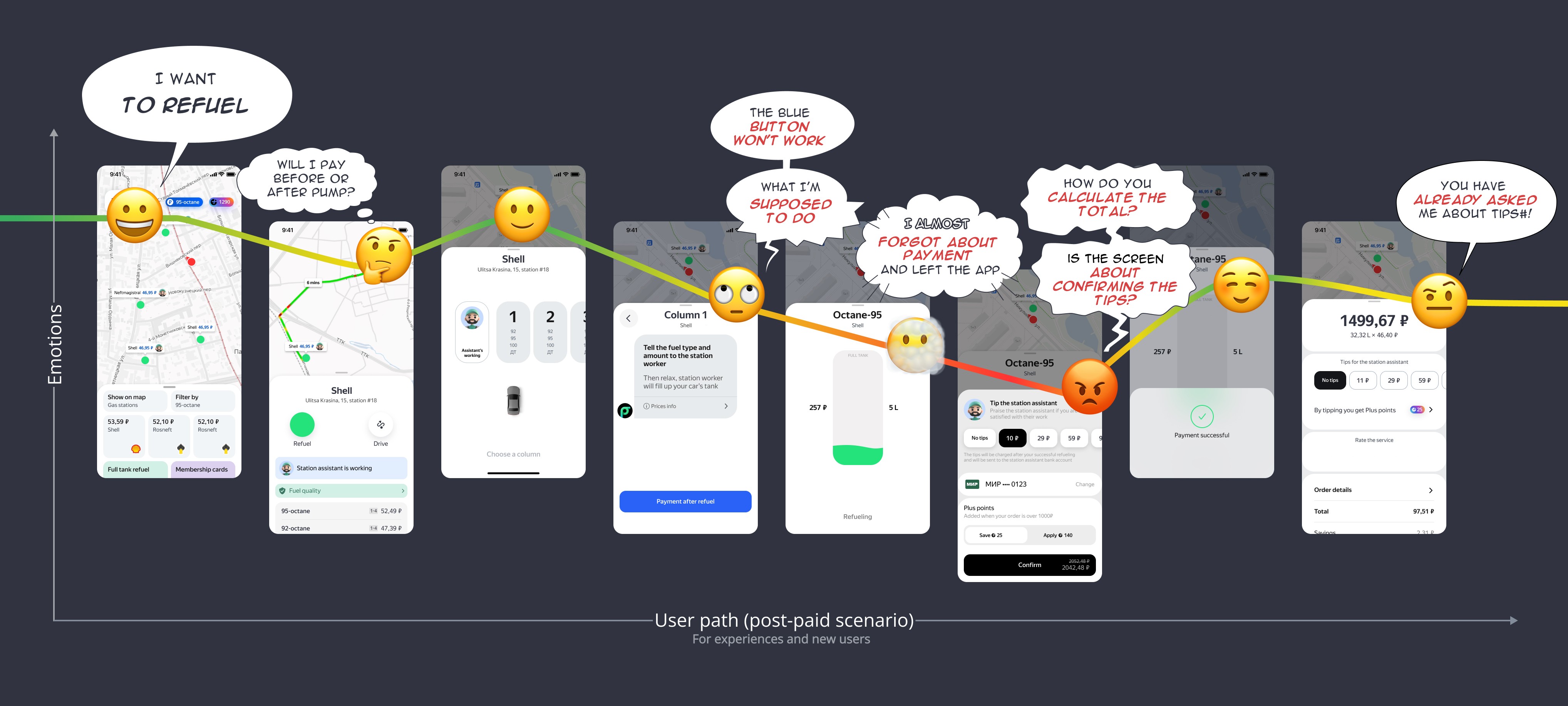
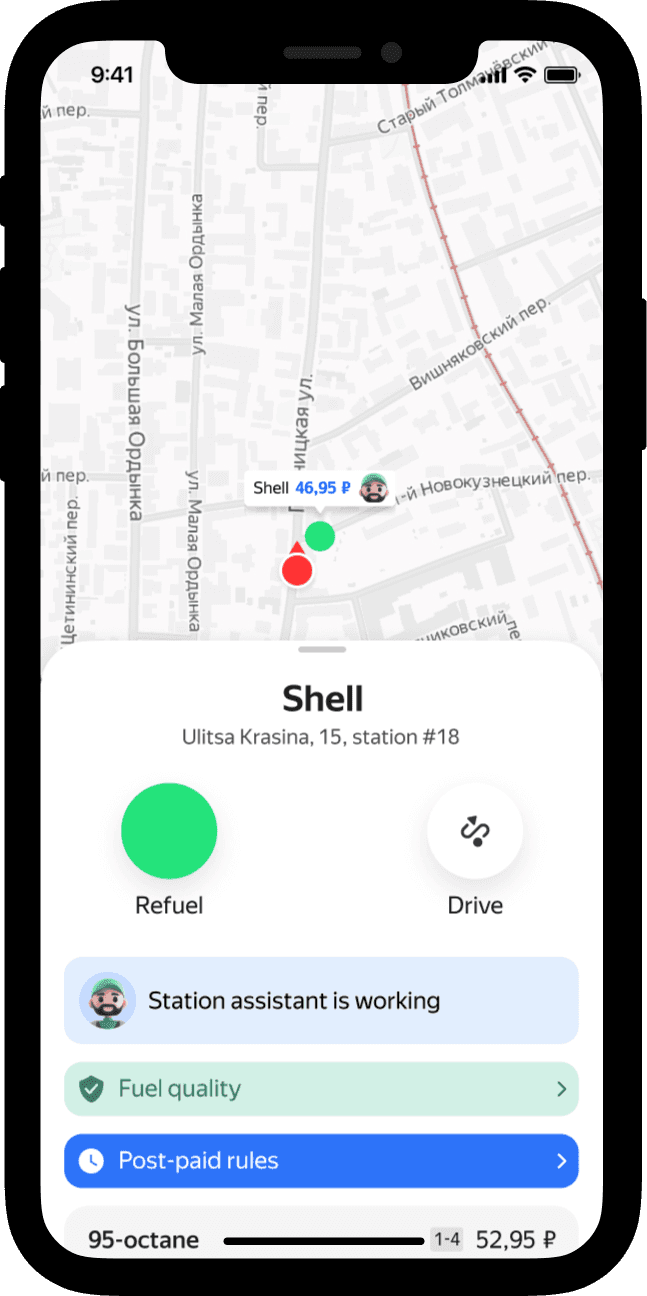
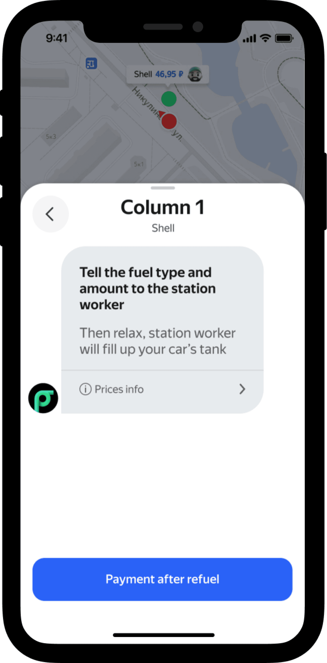
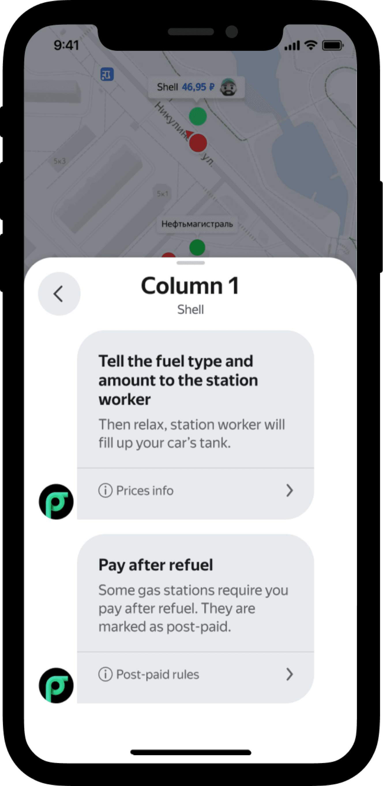
Post-paid scenario As-is
Research & investigation
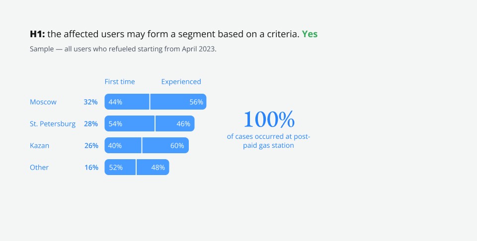
User Segmentation
The findings:
The issue occurs at post-paid gas stations only.
Experienced and new users face the problem with the same probability.
The following factors do not allow differentiation between the affected users and others: city, time of day, and gas station chain.
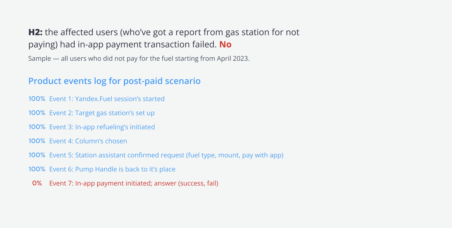
Event Logs Analysis
The findings:
The affected user did not attempt to confirm payment, they closed the app during or after the tank got filled.
They did not pay at the cashier’s either (the evidence are reports from gas station).
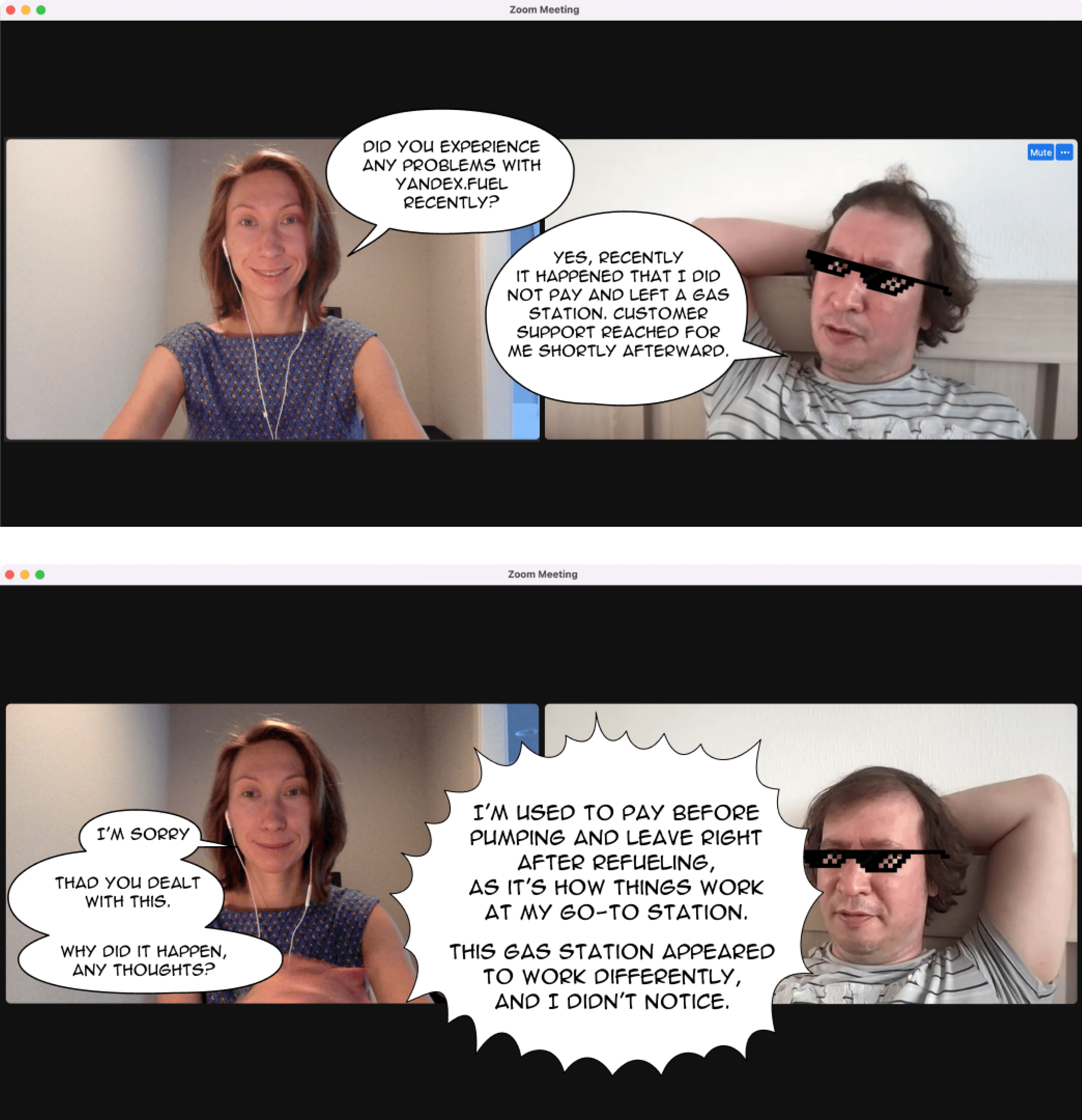
Interviews with affected users
I reached out to 16 affected people (they did noy pay for the fuel), and 5 agreed to participate.
The findings:
Experienced customers (3 out of 3) left the gas station out of habit, as they used to do at their regular pre-paid stations.
The first-time users (2 out of 2) said that they did not understand how it worked.
Field studies with UX Testing
Summary of the findings
Ideation & scoring
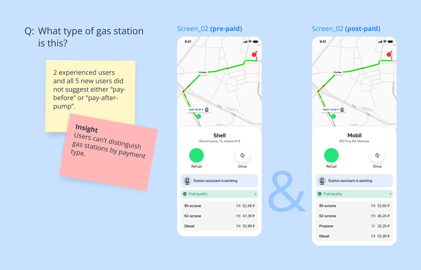
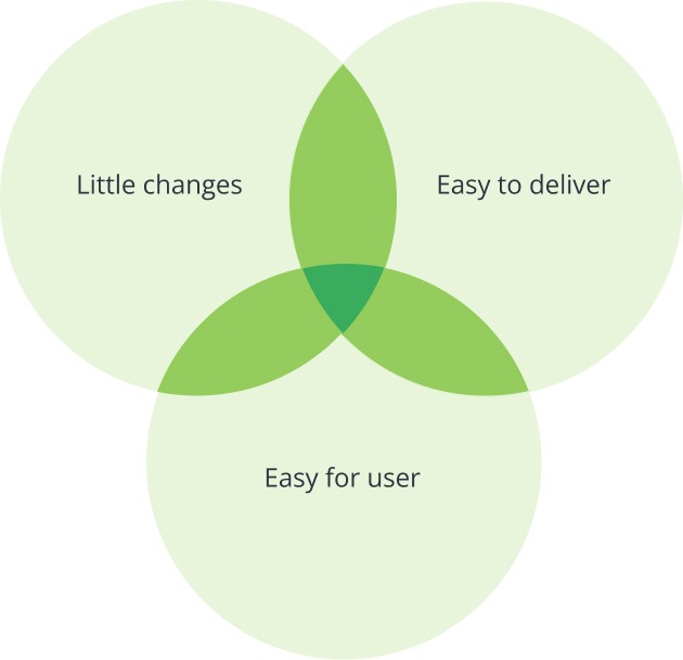
Users needed to recognize post-paid stations.
Hypothesis I
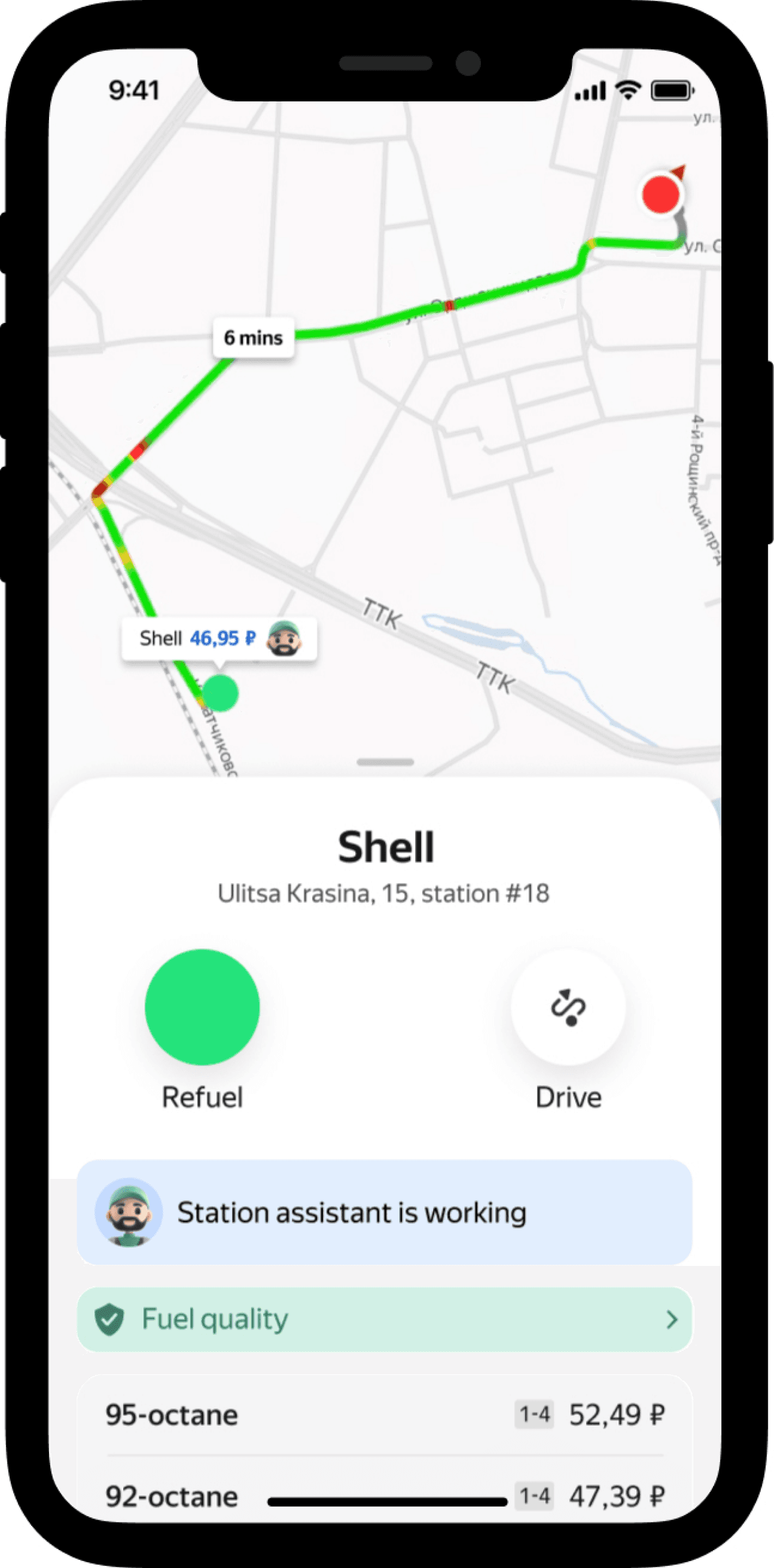
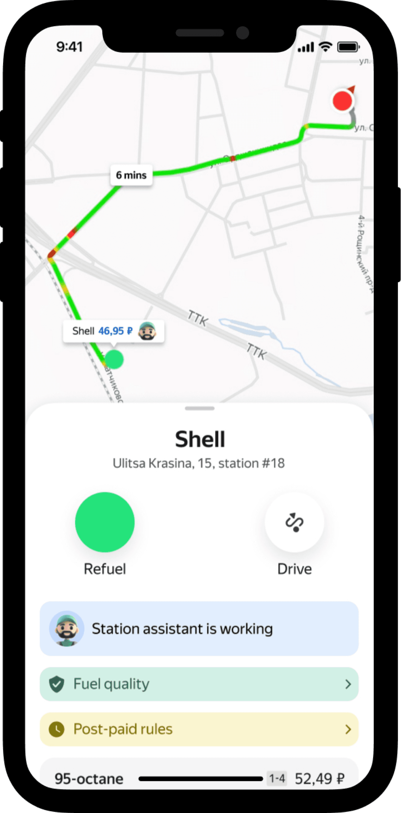
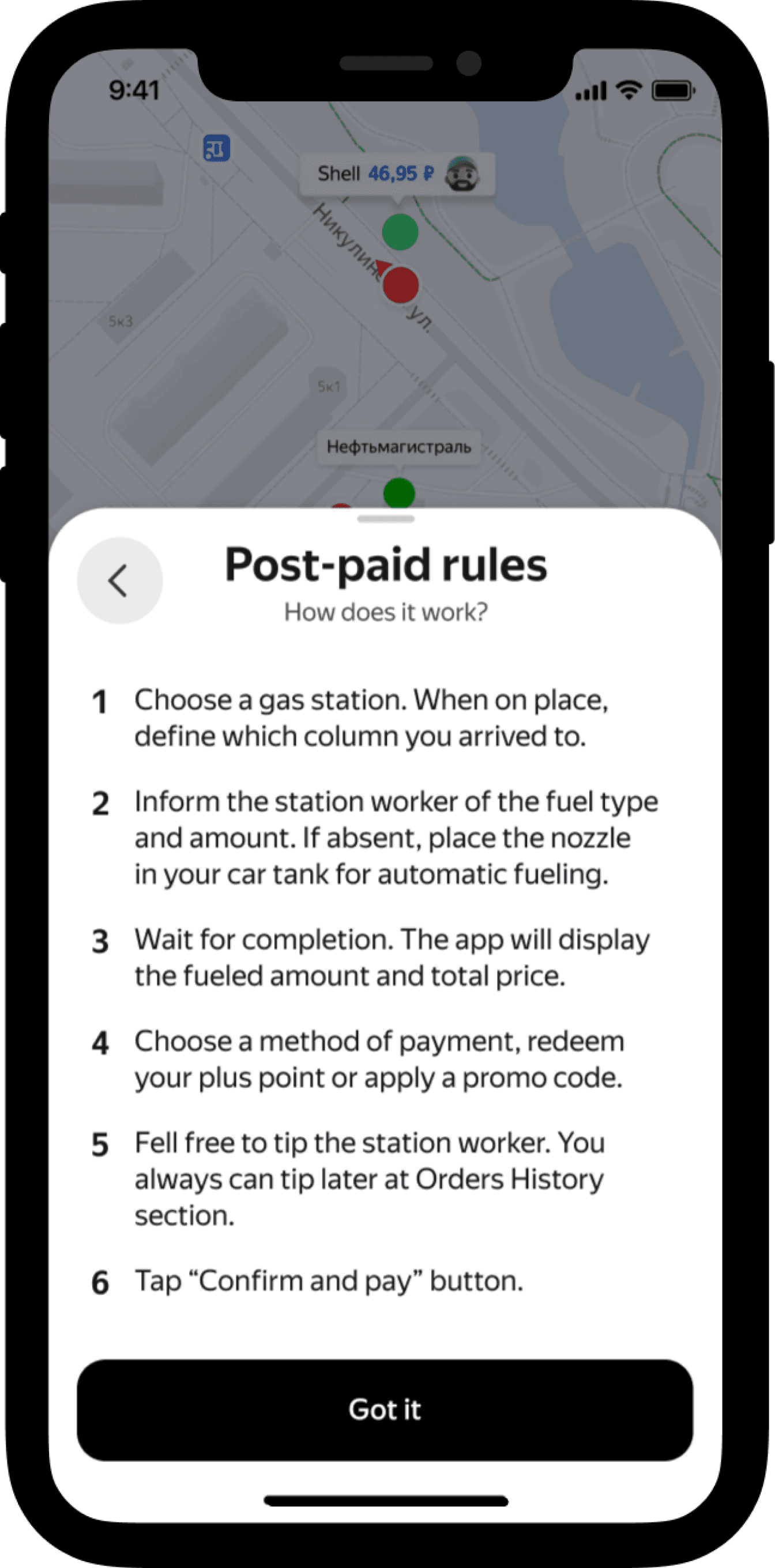
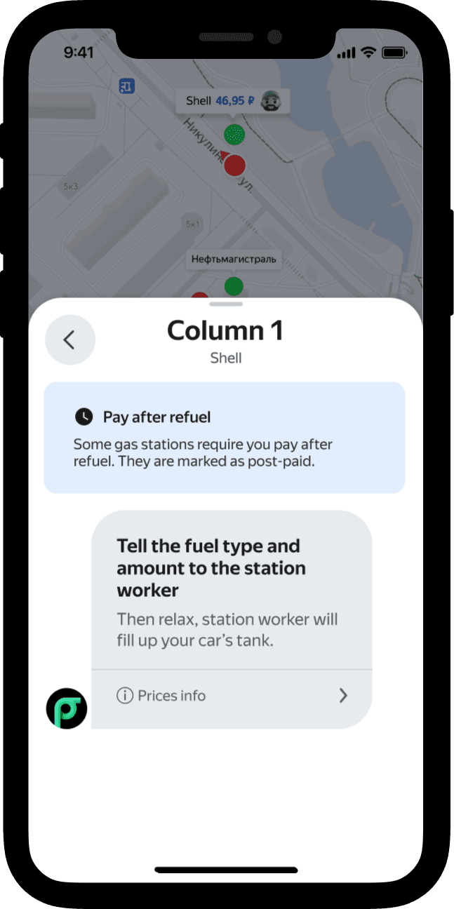
We can display the gas station type on the “Direction info” screen and show post-paid rules upon request.
Knowing the station type can help users make an informed choice at this step.
1
Placing the station type indicator in a visible location increases the likelihood that they will notice it.
2
Why not to display it on the map?
Firstly, it’s device memory-consuming.
Secondly, map may become a cluttered.
Lastly, gas station type is not the determining factor when choosing a gas station (according to User Research).
Why not to make gas station type more prominent?
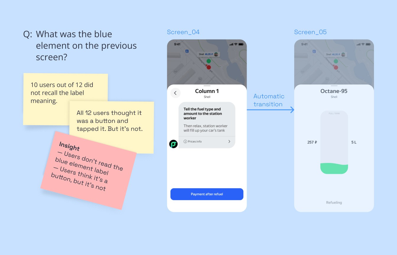
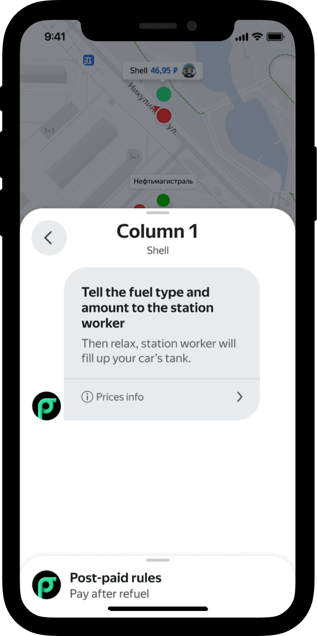
During User Testing with prototype 5 out of 10 people tapped on “Post-paid rules” button by mistake, they explained that it looked like a CTA (but it is not).
Why not mark up gas station type
at the gas stations physically?
It would require a lot of effort to collaborate with stations network. Consistency of solution implementation and the feedback speed would be at risk.
Hypothesis II
We can clarify that post-paid rules apply when the user is waiting for an attendant and about to place an order.
When users are waiting for a station worker, they have time to read the instructions.
1
This solution is easy to implement applying existing “message” component.
2
Animated mascot messages may attract users' attention.
3
I discarded this solution after User Testing with 5 exprerienced and 5 new users. 6 out of 10 people did not recall what was on the blue badge; I concluded that they did not read it.
During User Testing with prototype only 2 people out of 10 tapped on the bottom sheet. At the next step only 3 people recalled what was written on the bottom.
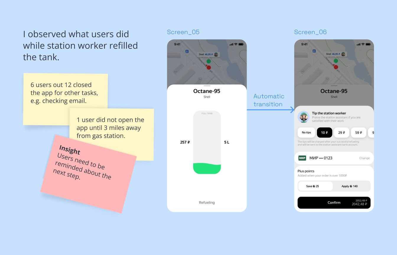
We had to ensure that users proceeded to payment after pumping.
How can we let users know that the next step after pumping will be the payment?
Hypothesis
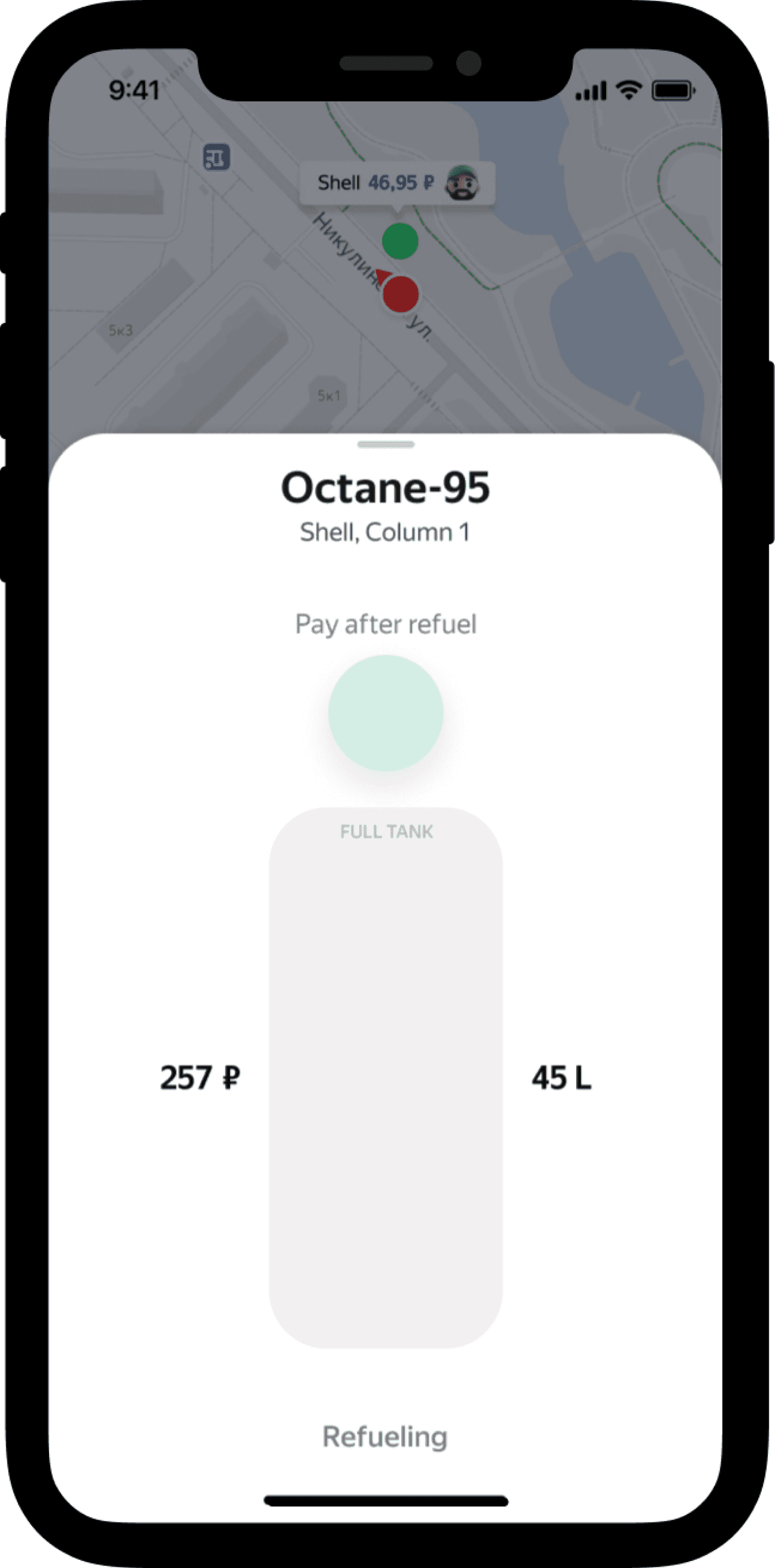
We can hint users about the upcoming payment step at the start and during pumping.
Why might this work?
The solution provides feedback on completion (“wayfinding” and “feedback” UX heuristic and are the best practice).
1
Having the reminder placed in the focal point of the screen ensures that users will likely see it.
2
I discarded this solution after UX testing. Although people noticed the button during User Testing, 3 people out of 10 tried to tap during refueling being in process. They told that it was frustrating that nothing happens.
I, along with my team, decided to discard the solution because there's neither CTA no feedback on refuel completion.
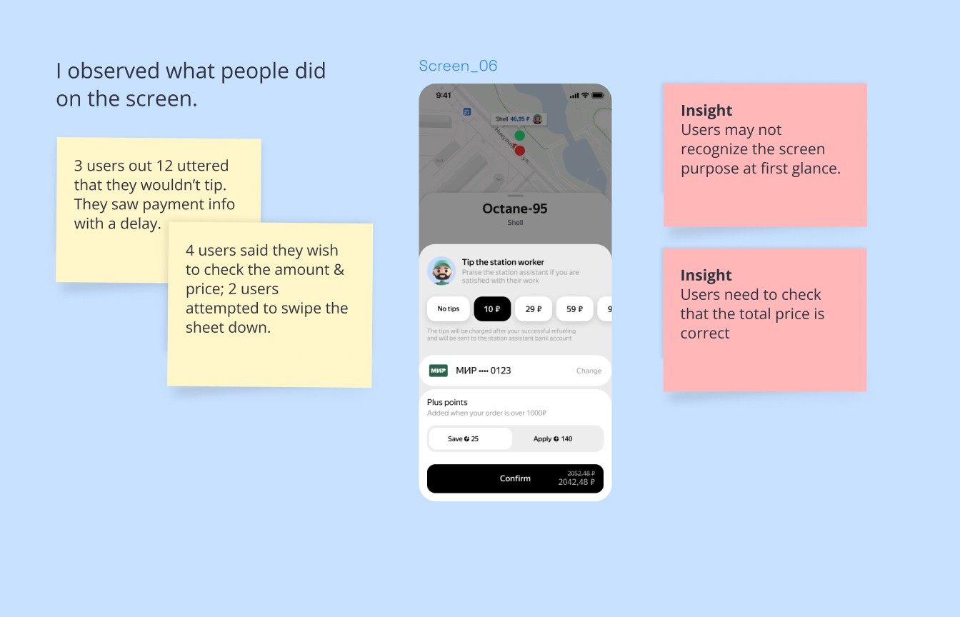
Users needed to recognize the purpose of the payment screen.
Hypothesis
A screen title helps users understand their current location in the app.
1
Showing “L×price” may prevent users from trying go back to find the data.
2
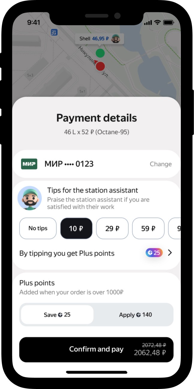
Moving “Payment method” up will tone-down “Tips” section, and users won’t be confused about the purpose of the screen.
3
The CTA will clearly describe its action, helping users understand the screen's purpose.
4
Prototyping and solution verification
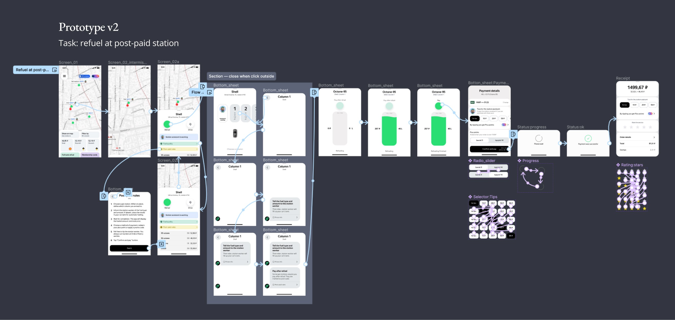
After corridor testing I conducted UX tests with prototype:
— 3 people (out of 14 interviewees) closed the app during pumping, they opened it back though to complete payment
— 5 people read “post-paid” rules
— all users refueled and completed and payed
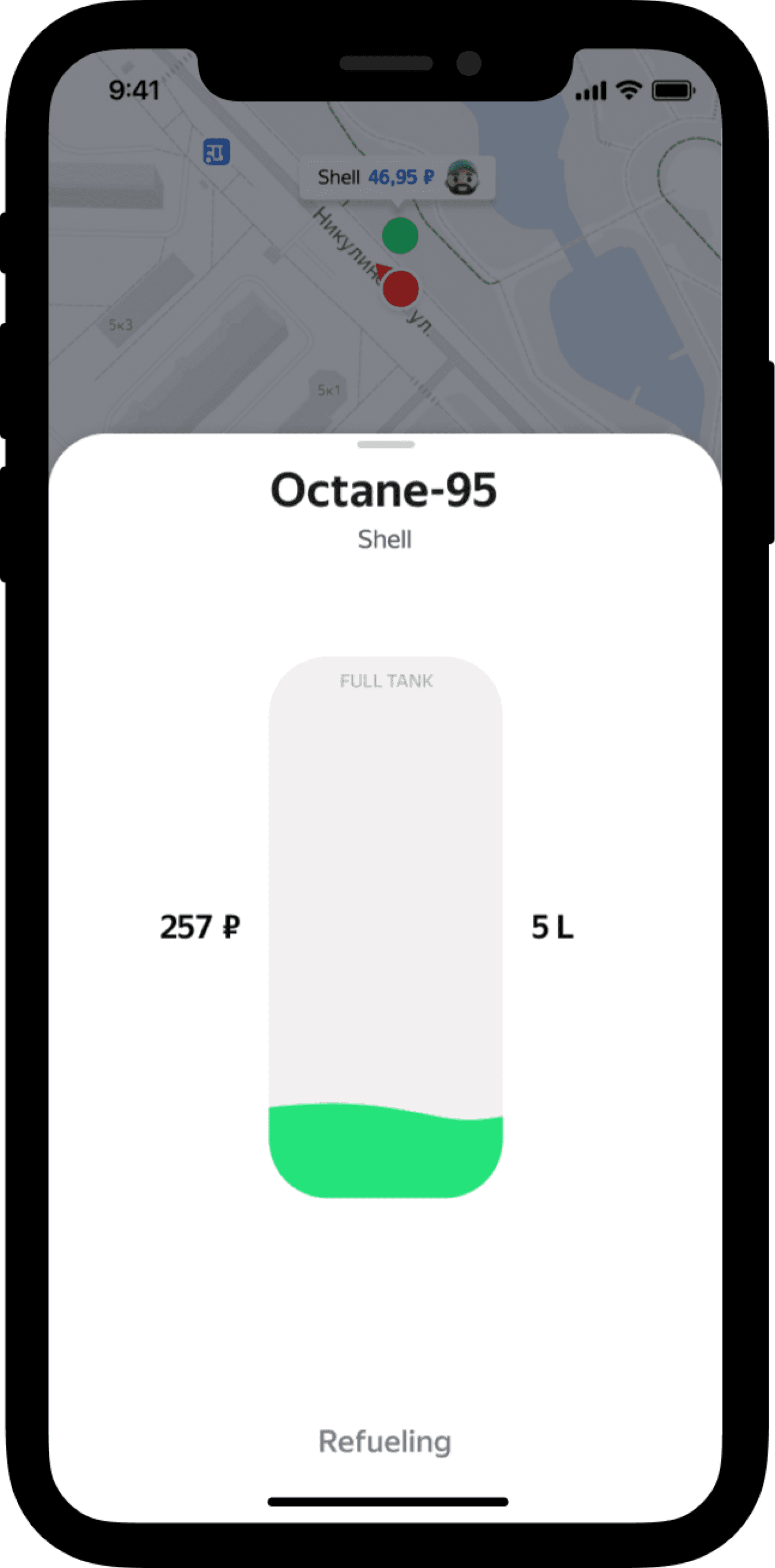
I also conducted unmoderated side-by-side test for Screen_05 (fuel is being pumped):
— 8 votes for “before”
— 48 votes for “after”
Final prototype
One last improvement
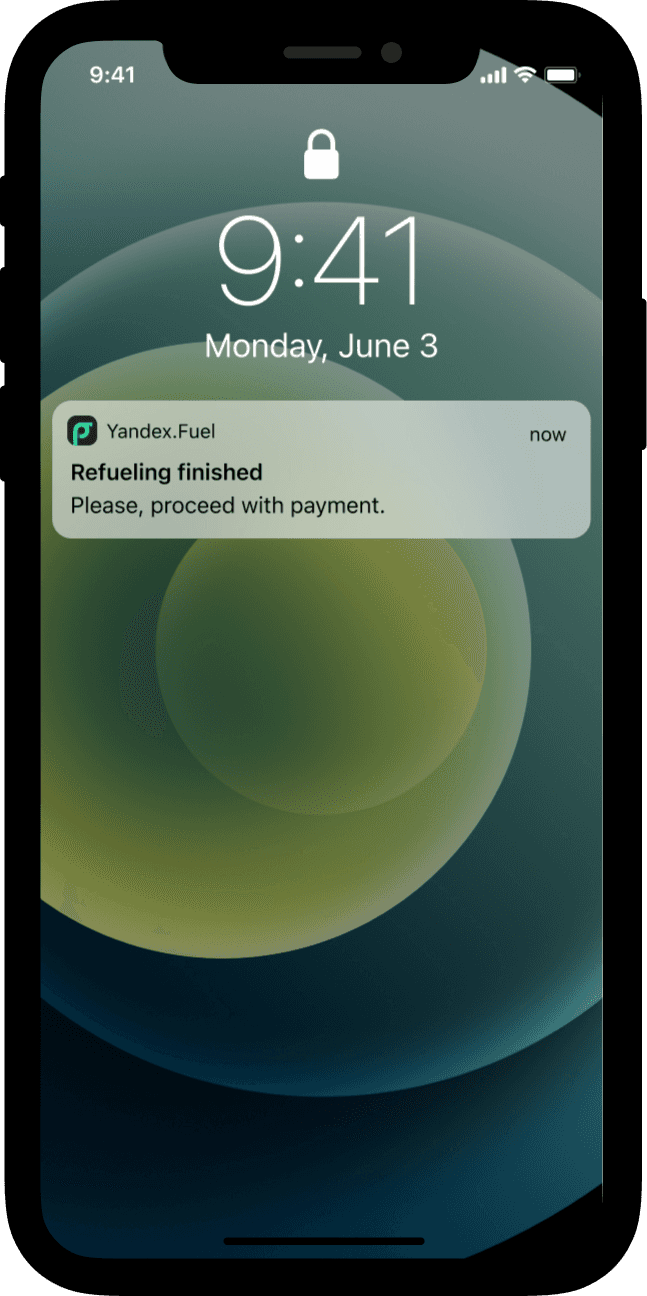
3 people (out of 14 interviewees) closed the app during pumping, they opened it back though.
To address users’ need to get drawn back to the process we decided to add a push notification with haptic vibration when the nozzle’s back if the app is on background.
Delivery
It took us around two weeks to a solid design proposal.
In our MVP we had to drop a few things, e.g. the scenario with the station workers not being present. It allowed us to cut the development time.
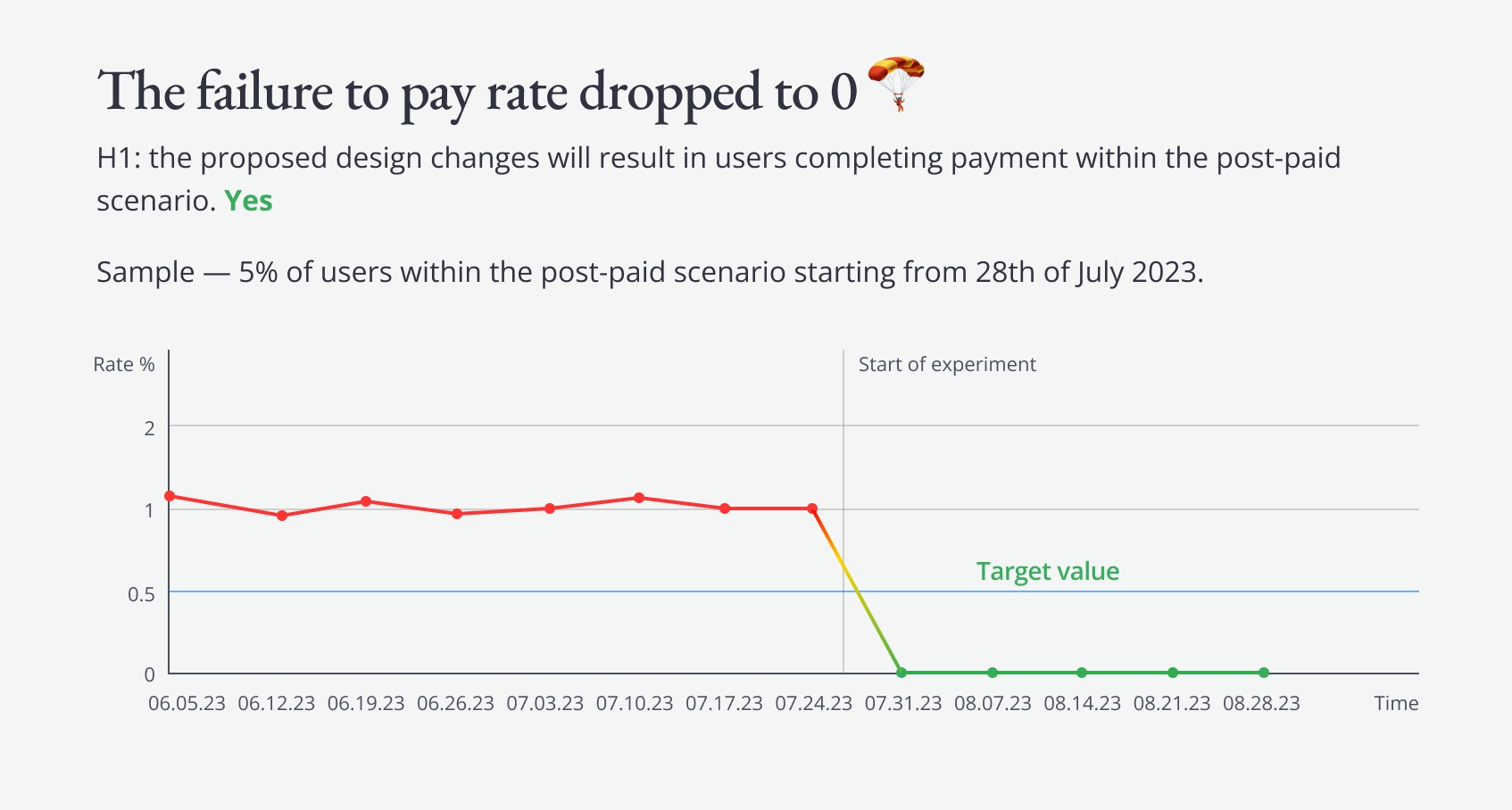
A gradual AB rollout (starting with 5% of the audience and then increasing) helped us verify and confirm that we reduced the rate of problem cases to 0.
Results and outcomes
The rate of cases where users left the stations without confirming payment dropped to 0 (Q3, 2023)! 🥳 — negative outcomes faced at the beginning of the project are no longer a risk.
Learnings
Kirill Starosta
Product Manager
Eugenia Shar
System Analyst
Olga Manina
Data Scientist
Daria Levin
Engineering Lead
Staci Lebedeva
Product Designer
