August–October 2023
Problem
The upsell conversion rate within the “Checkout with Plus” scenario was 14%, lower than anticipated. Leadership recognized the potential for revenue growth and decided to focus on improving upsell conversion.
The upsell screen was integrated into the “Checkout with Plus” scenario, which was experienced by more than 800k users each month. If our team had increased the upsell conversion rate by just 1%, the monthly revenue could have increased by over 2.3 million rubles.
The upsold subscriptions
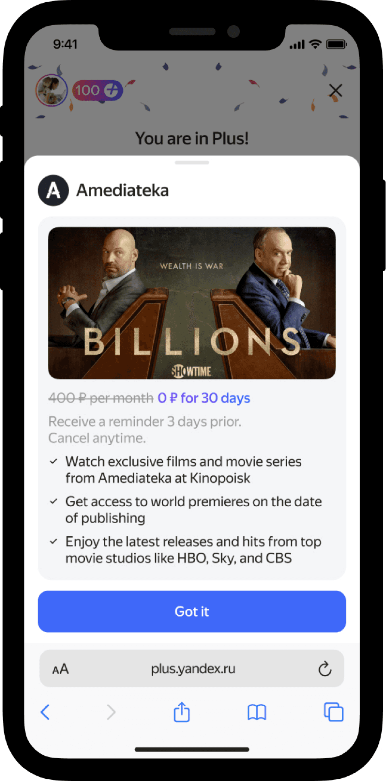
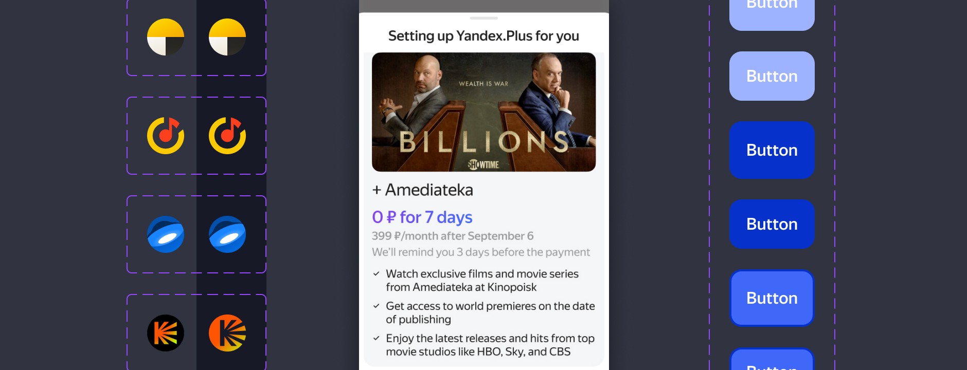
Amediateka
48,000
X5
29,00
Match Soccer Ball TV
900
More.tv
600
Match Premier
300
Plus Multi
300
Plus Kids
0
The business goal
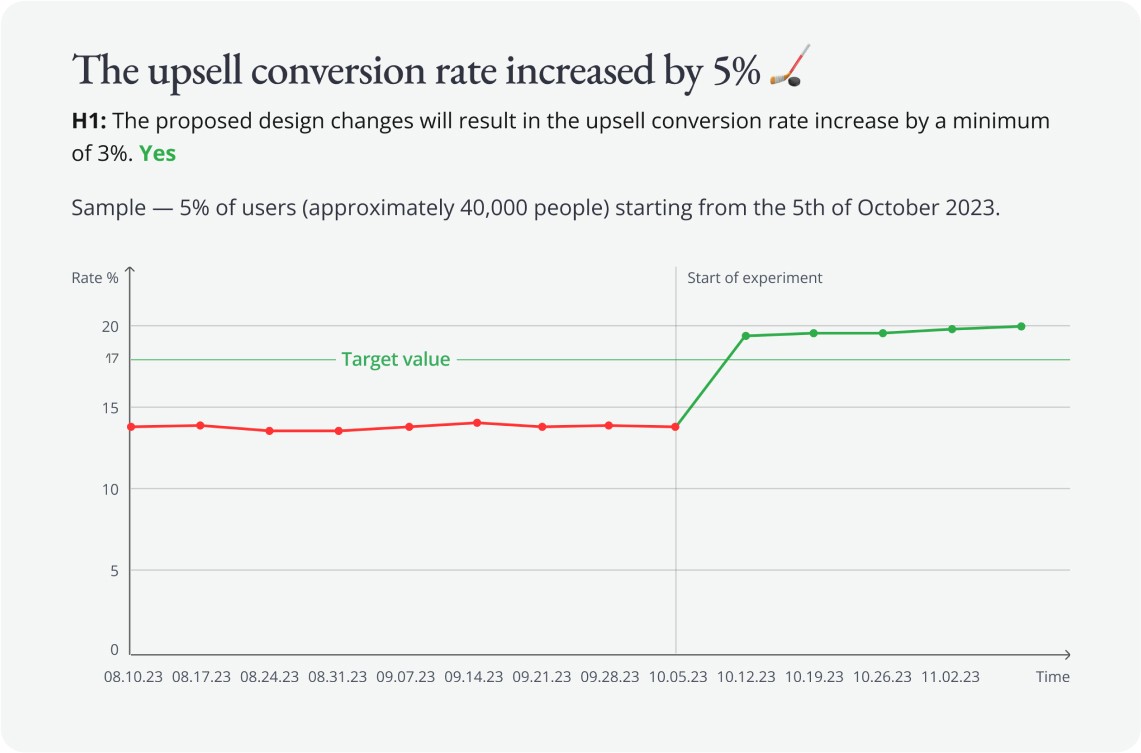
To increase the upsell conversion rate by 3%, aiming to raise the Average Revenue Per Paying User (ARPPU).
My role ⌘ + ...
Context
Target audience
Business strategy
Key metrics
Monetization
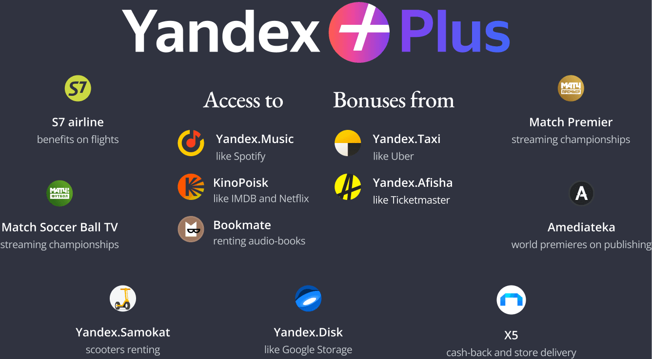
“Plus” as a product
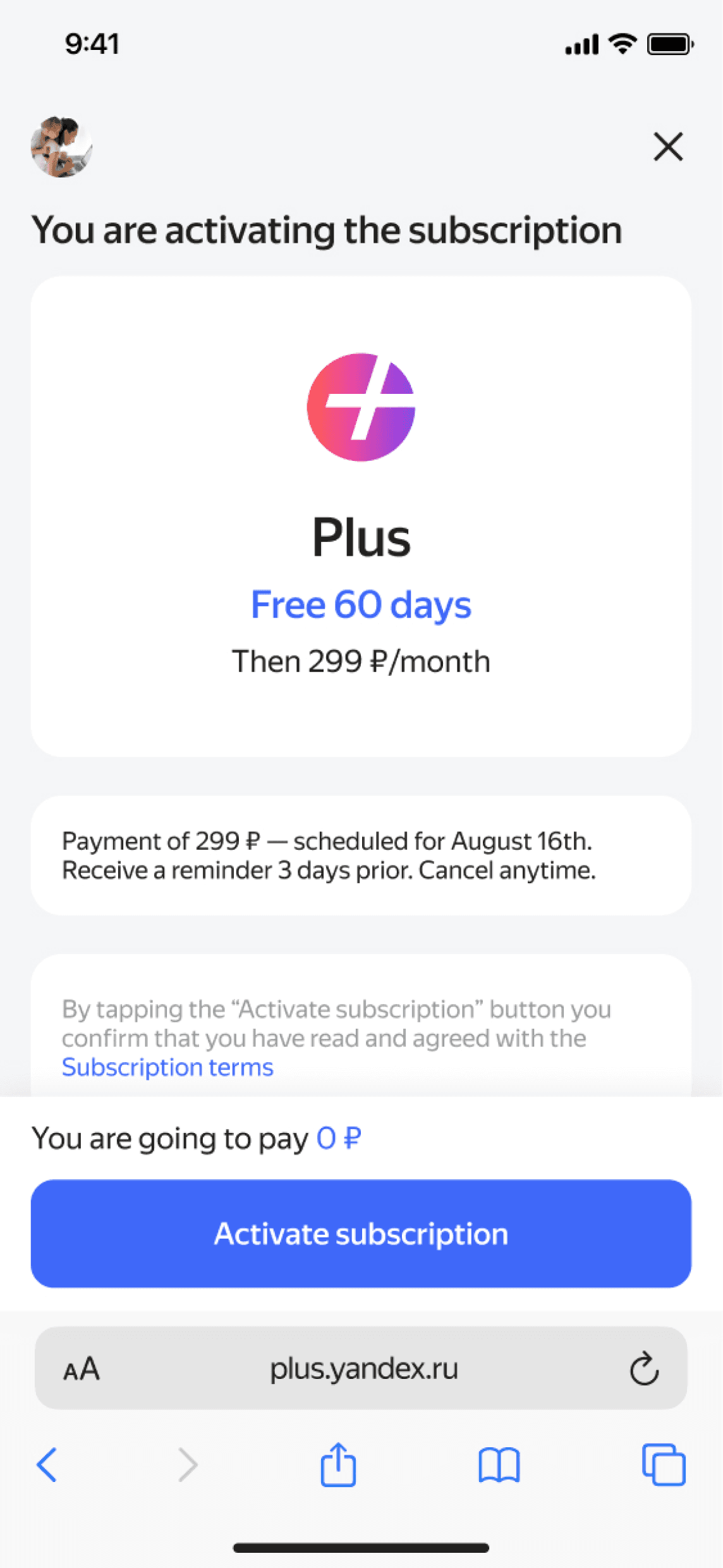
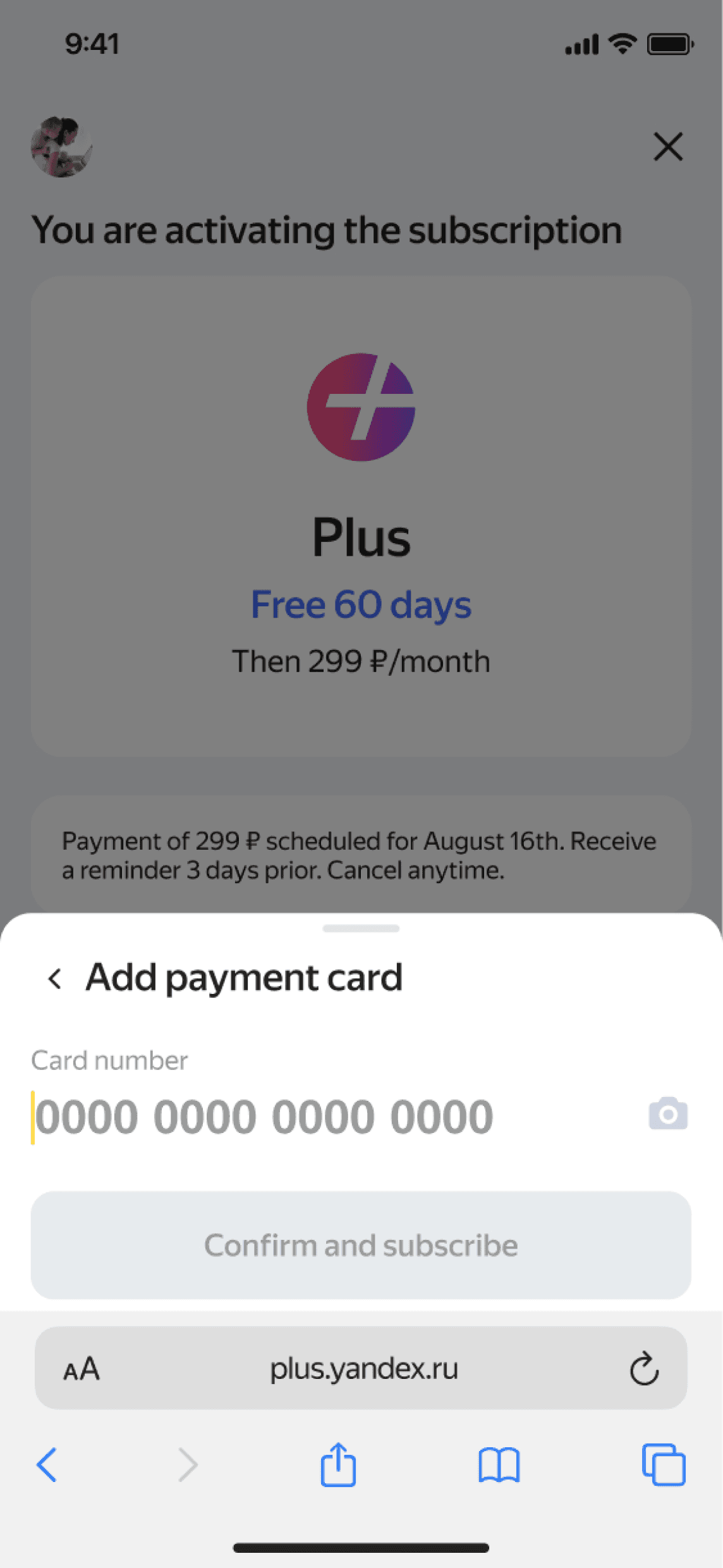
Users may upgrade for more services for additional price.
Types of upsell offerings in Plus
The type of offering depends on team's decision and context (e.g. users who had been subscribed to the service don't need the Trial):
— Intro
— Trial
— Full-price
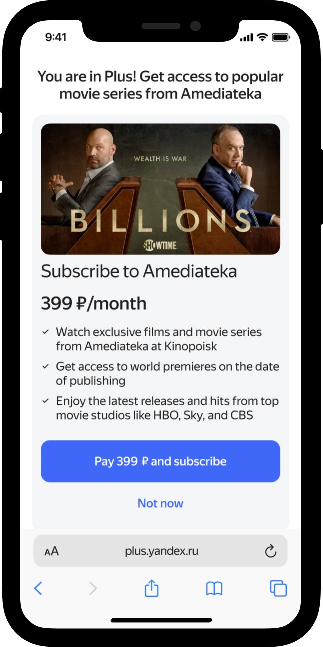
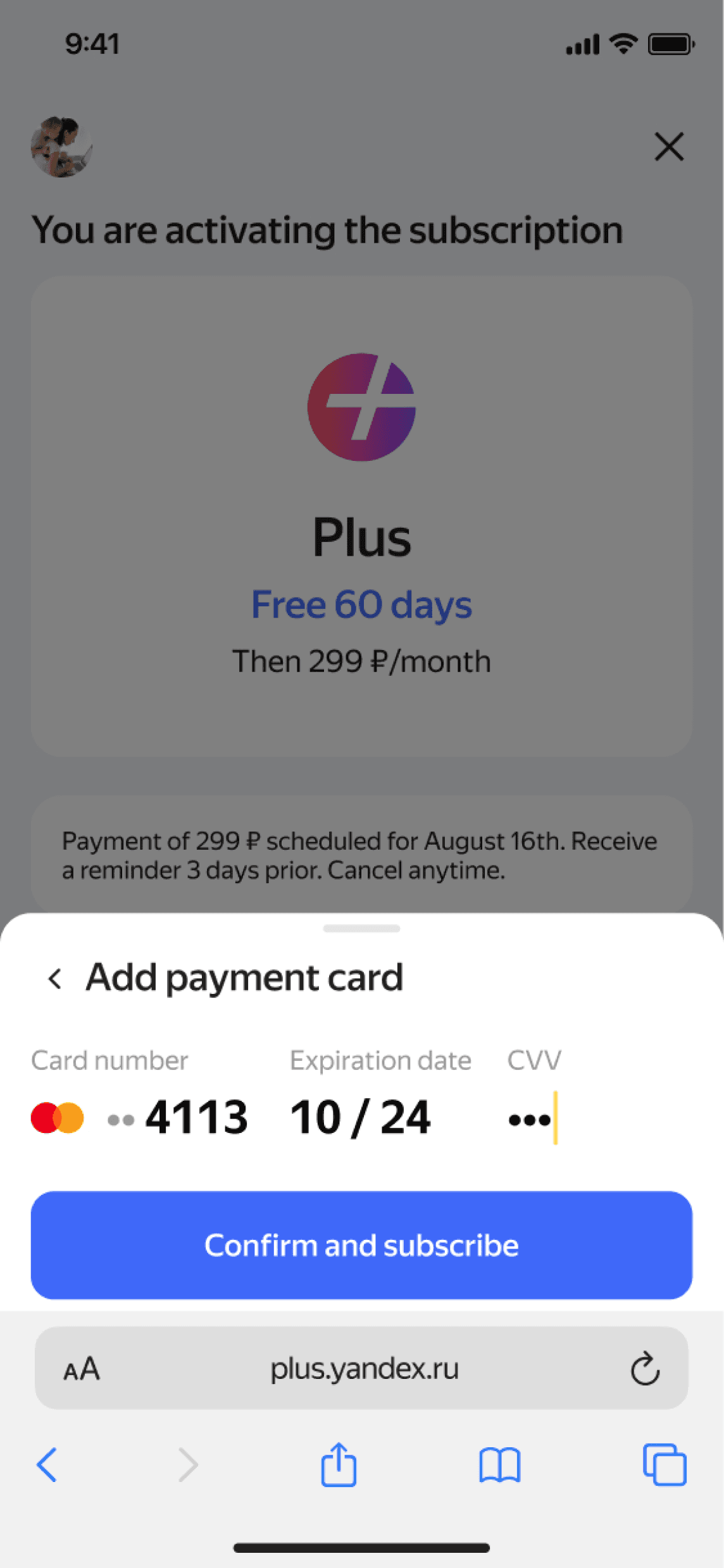
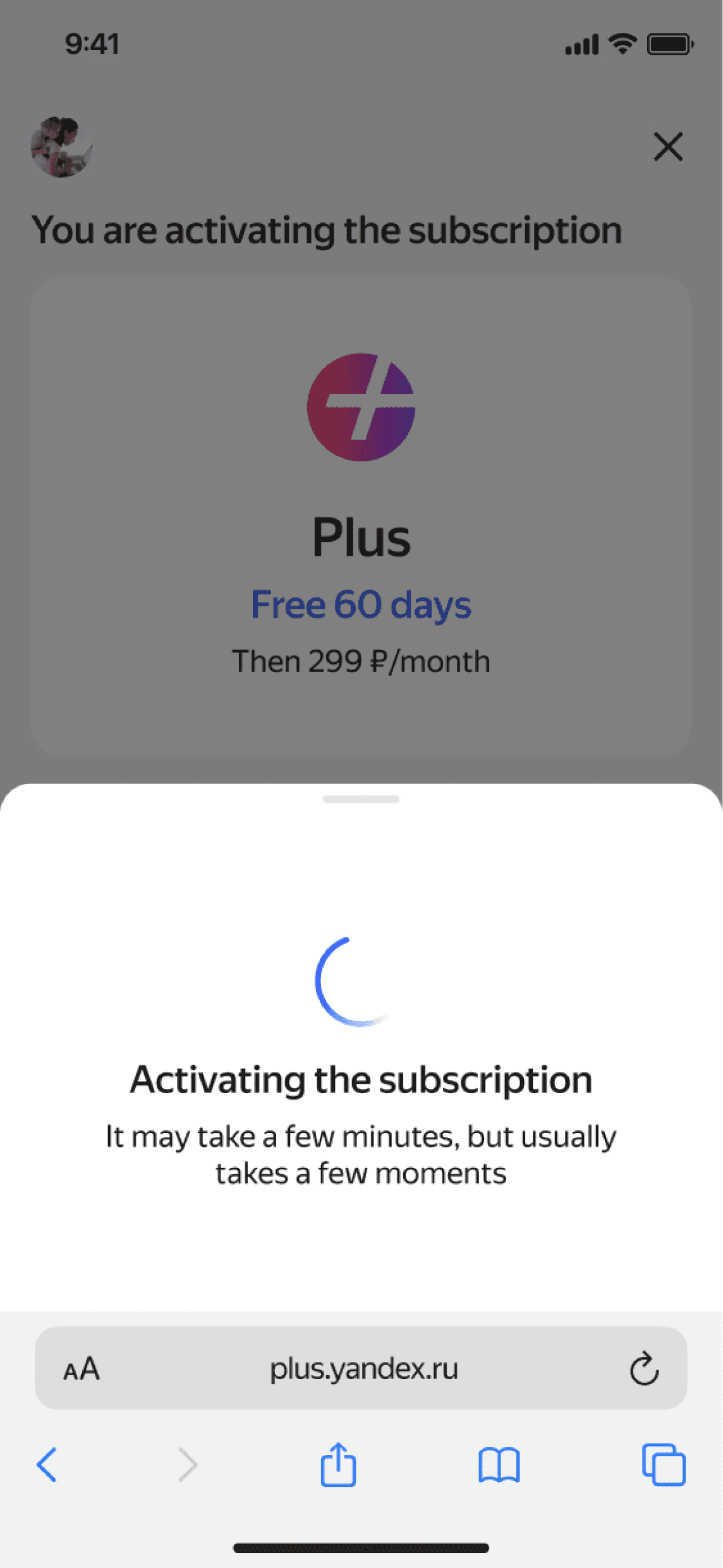
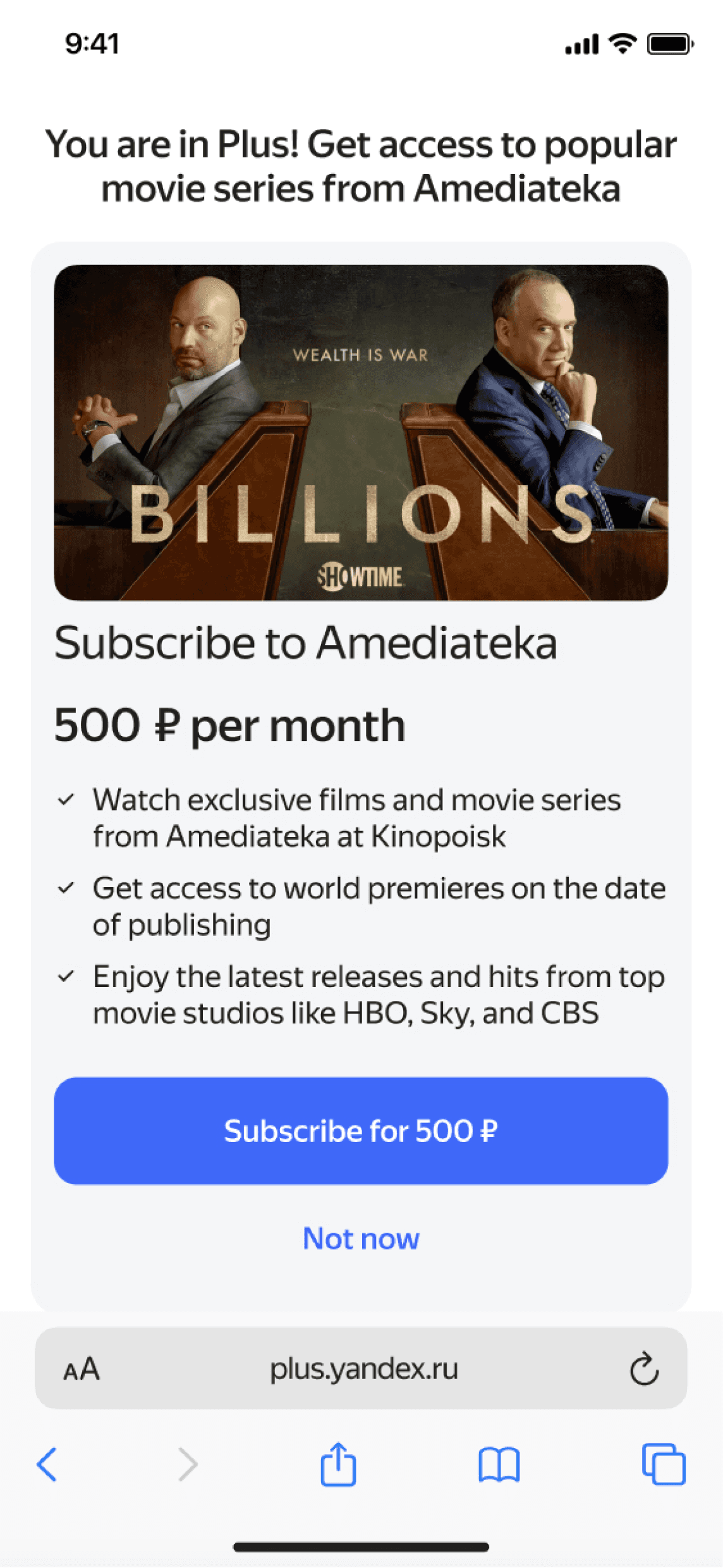
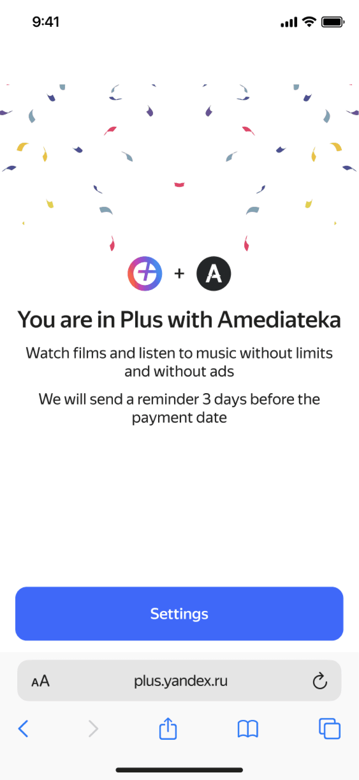
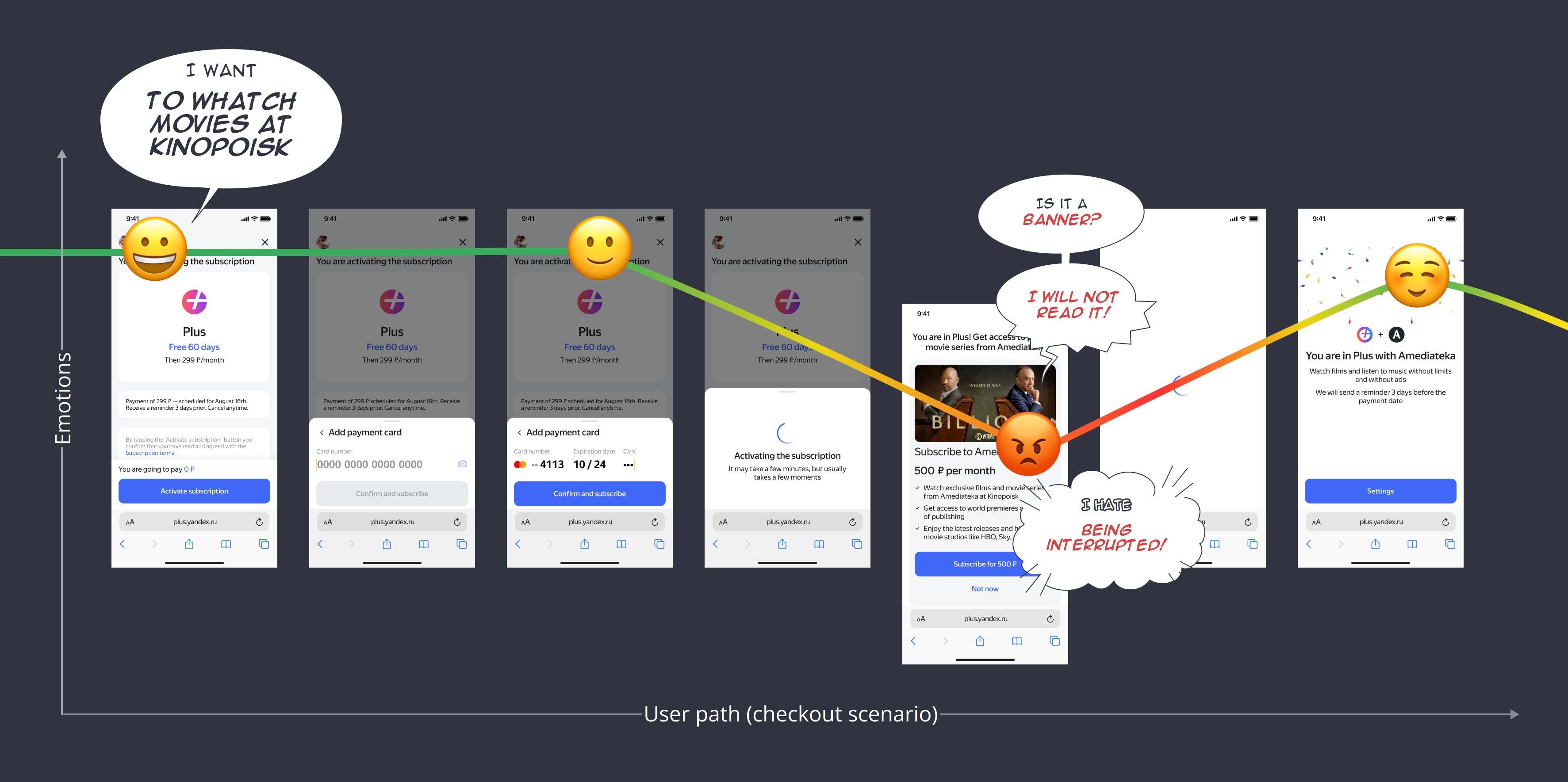
Checkout scenario As-is
Research & investigation
Summary of the findings
Ideation & scoring
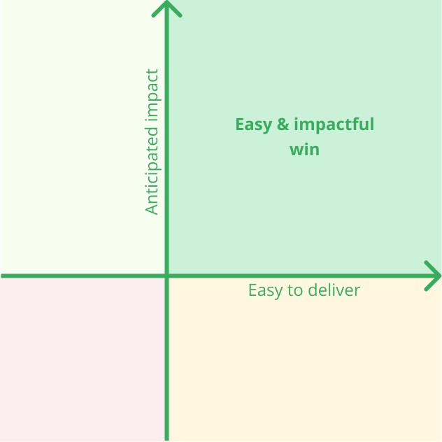
During brainstorming sessions, our team set on agreement about scoring our solutions — easy & impactful win.
The key constraints to consider:
We could not decrease prices or enlarge trial periods.
Upsell terms (prices and N-days of trial) should stay the product team’s decision.
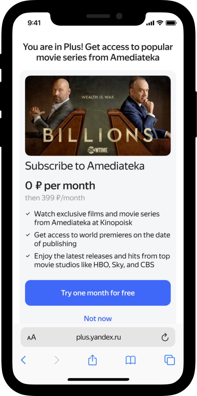
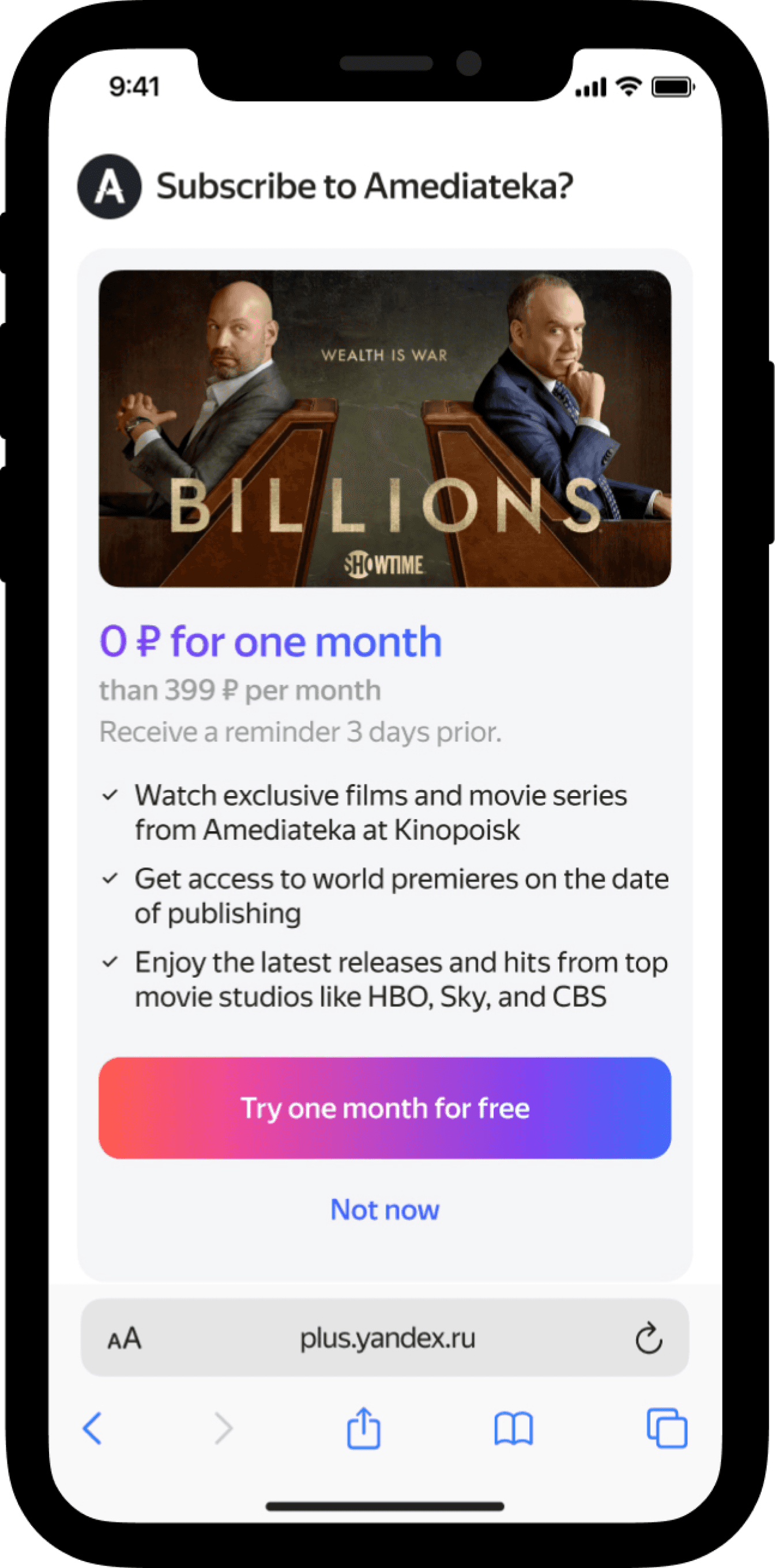
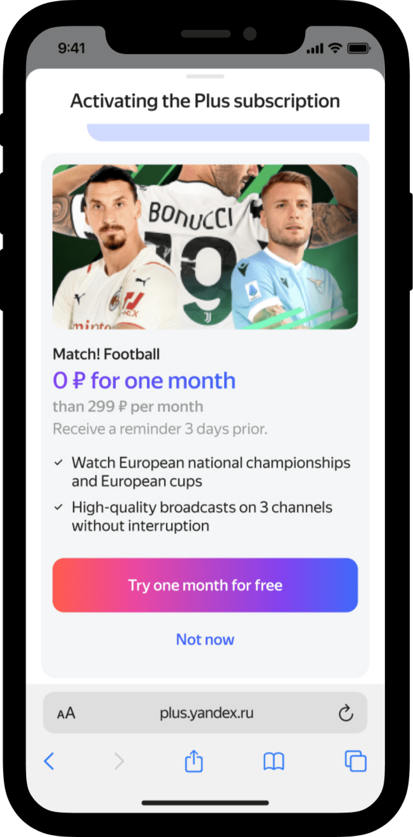
Iteration#1—showing the Upsell screen with a better layout when checking-out is finished.
How can we:
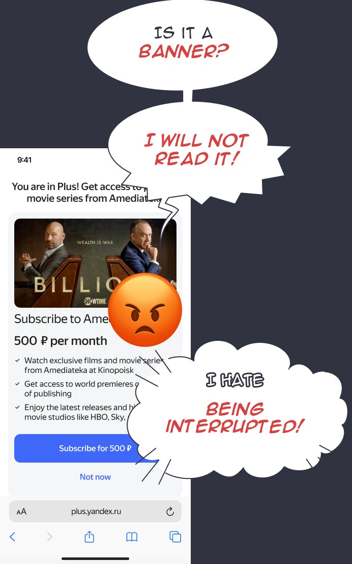
Upsell without interrupting user during check-outing with Plus?
Help user understand the offer without cognitive load?
Hypothesis
We can show the Upsell screen on checkout finish.
Users won't perceive the Upsell screen as an obstacle because the check-outing with Plus scenario is finished.
1
The screen title is concise and direct, and cancellation period concerns are addressed.
2
User Testing and side-by-side results were not good enough.
User Testing results:
— only 2 people out of 7 subscribed to Amediateka
— 2 people said they expected to see Settings screen
— 2 people didn’t read the offer and automatically tapped [Not now]
— 1 person was disappointed to see an add
Unmoderated side-by-side testing (50/50):
— 42 votes for “before” Upsell screen
— 67 votes for “after” Upsell screen
Iteration#2—upselling within the checkout scenario only on user’s demand.
How can we:
Upsell without interrupting user during check-outing with Plus?
Help user understand the offer without cognitive load?
Hypothesis
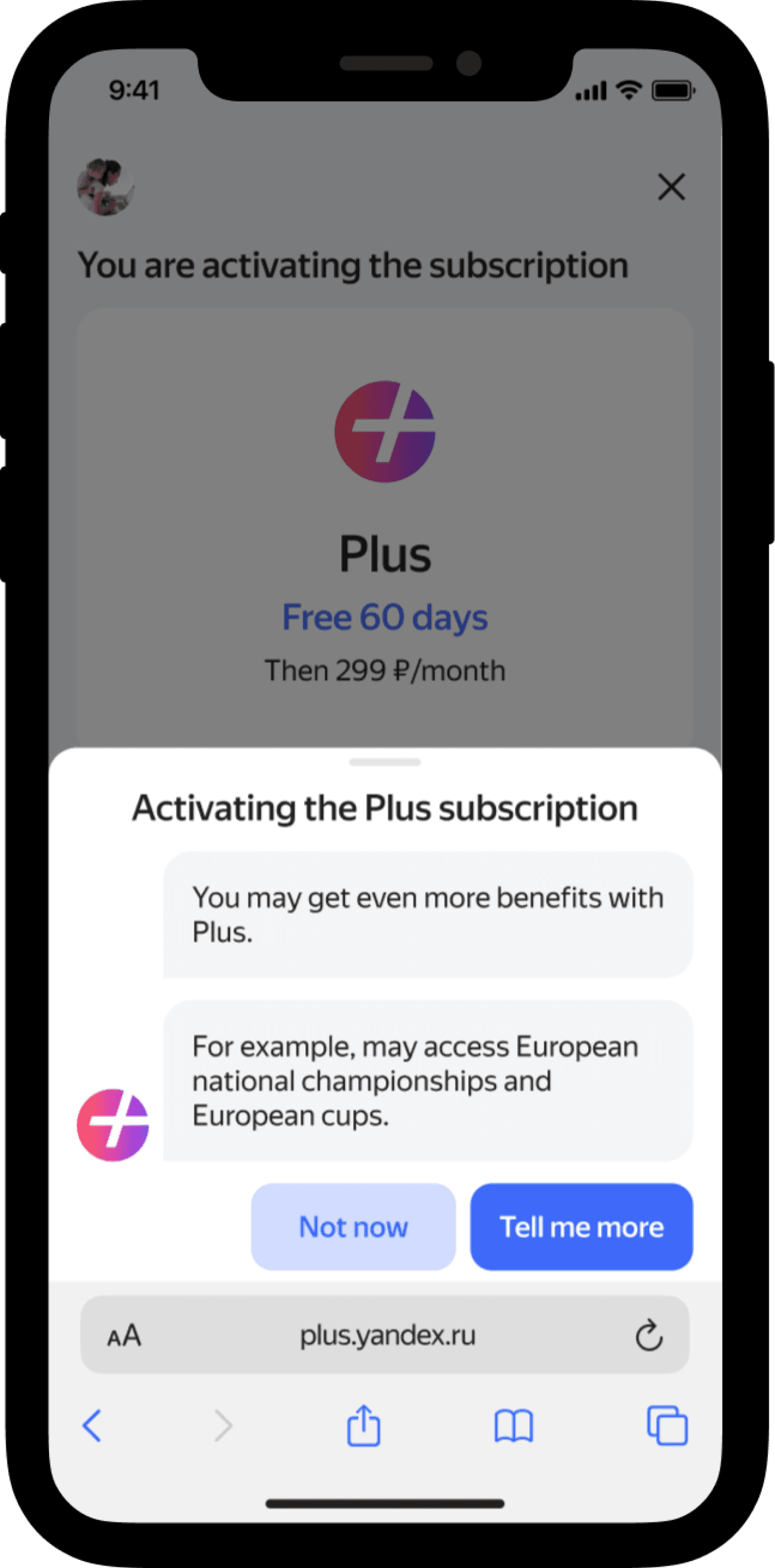
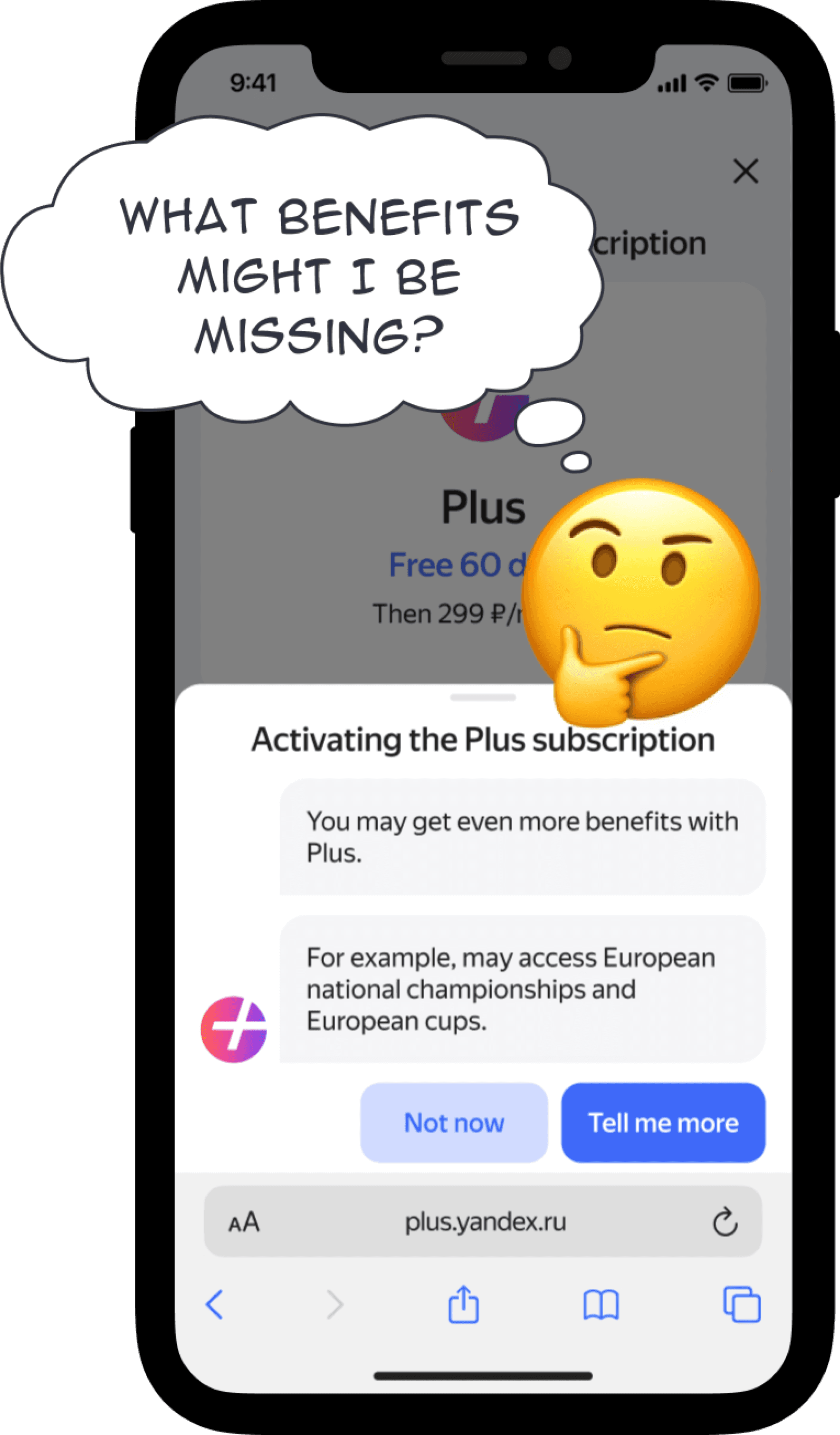
We can introduce a mascot bot to offer extra benefits and show the Upsell screen only if the user requests it.
Users are in control to decide if they want to see the offer or not.
1
Animated mascot messages may draw user’s attention.
2
The screen title is concise and direct, and concerns about the cancellation period are addressed.
3
User Testing and side-by-side results were not good enough.
User Testing results:
— 5 people out of 7 agreed to see the offer
— those 5 people asked “what other services available with Plus?”
— 2 people subscribed to Amediateka after looking at the offer
Unmoderated side-by-side testing (50/50):
— 42 votes for “before” Upsell screen
— 55 votes for “after” Upsell screen
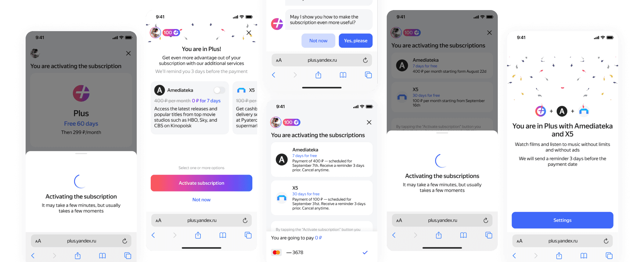
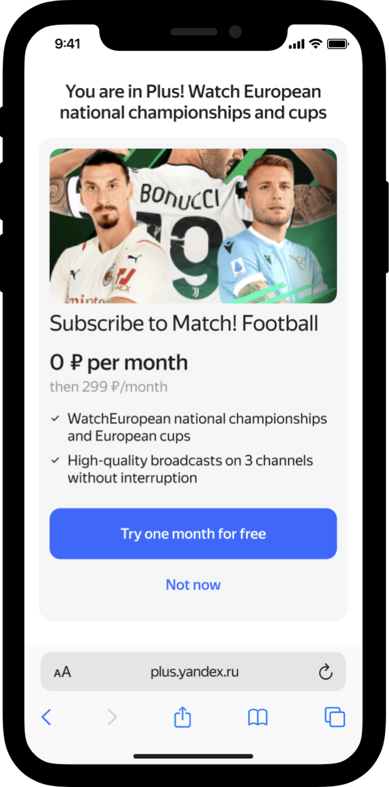
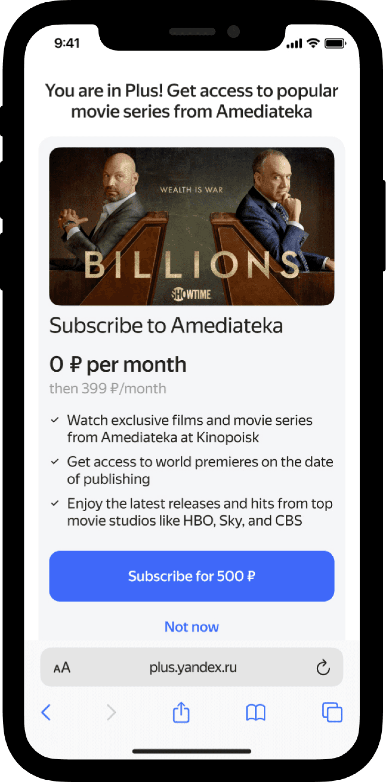
Iteration#3—upselling multiple services on the subscription success screen.
How can we:
Upsell without interrupting user's check-outing?
Help user understand the offer without cognitive load?
Help user to understand what services available?
Hypothesis
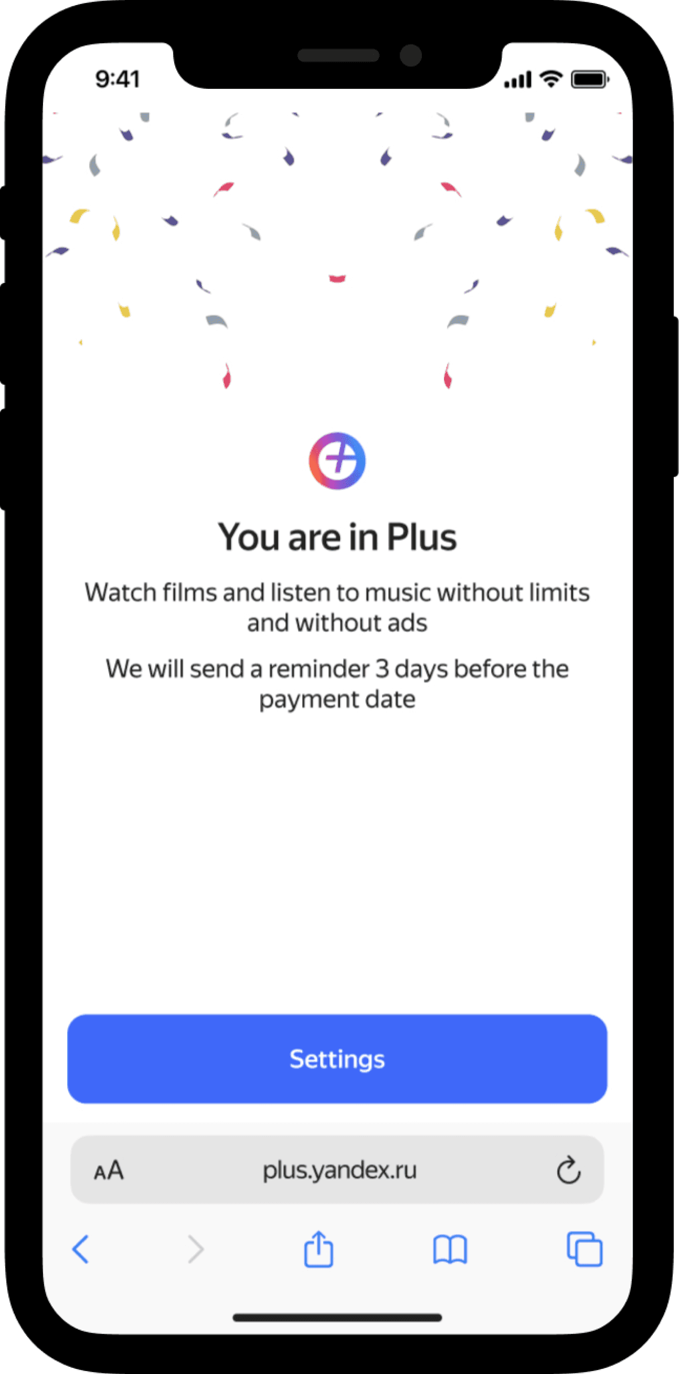
User may be relaxed and ready to perceive new information once subscribing to Plus is finished.
1
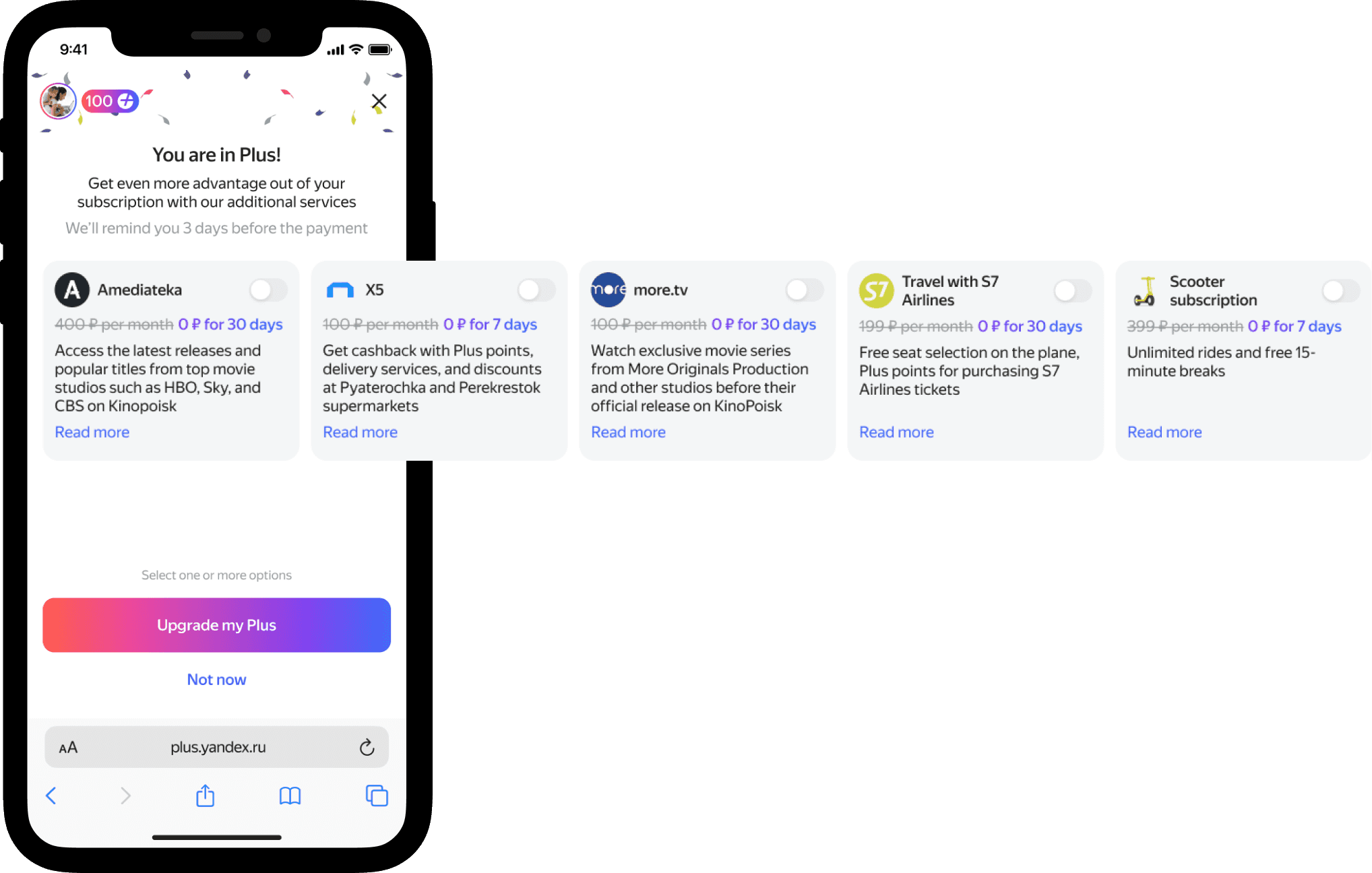
Each user may find a useful service. This increases the chance to upsell.
2
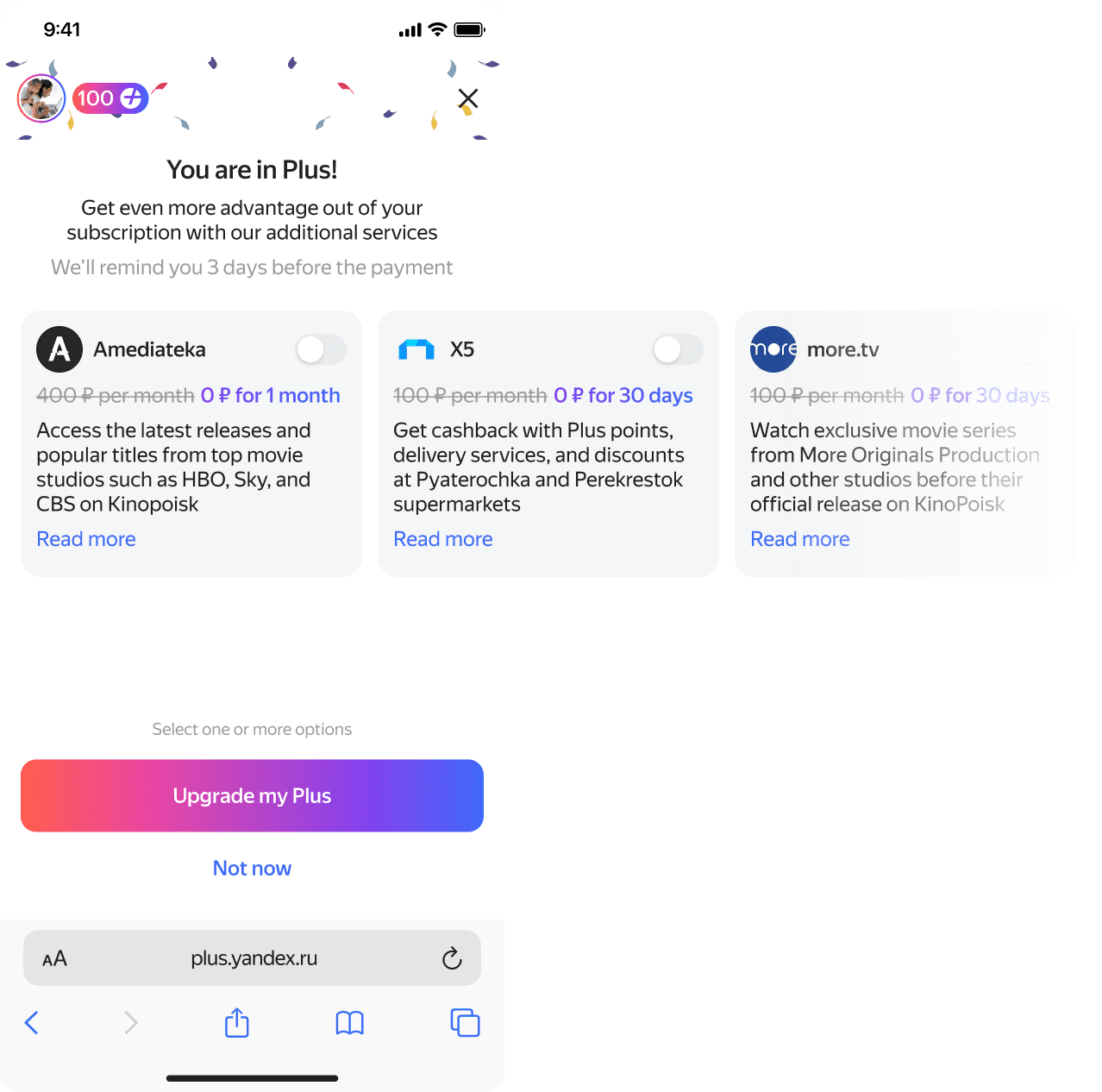
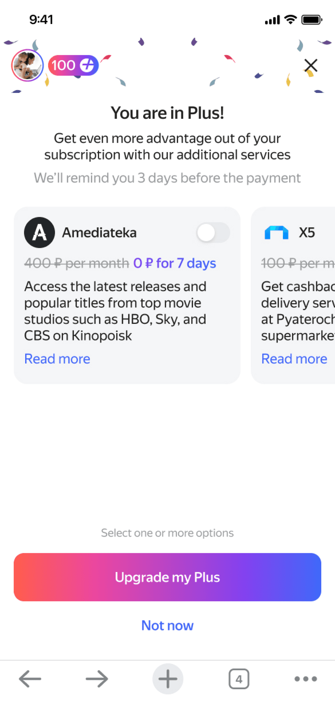
The title explicitly with CTA describe the purpose of the screen. Screen is not overloaded with text, and more info shown on user’s demand.
3
Prototyping and solution verification
After corridor testing I performed UX tests with prototype:
— 4 people out of 7 upgraded their Plus with one or two additional services
— nobody skipped the screen without reading the offer
— all users noted that they would connect services that are useful to them
I also conducted unmoderated side-by-side test:
— 6 votes for “before” Upsell screen
— 68 votes for “after” Upsell screen
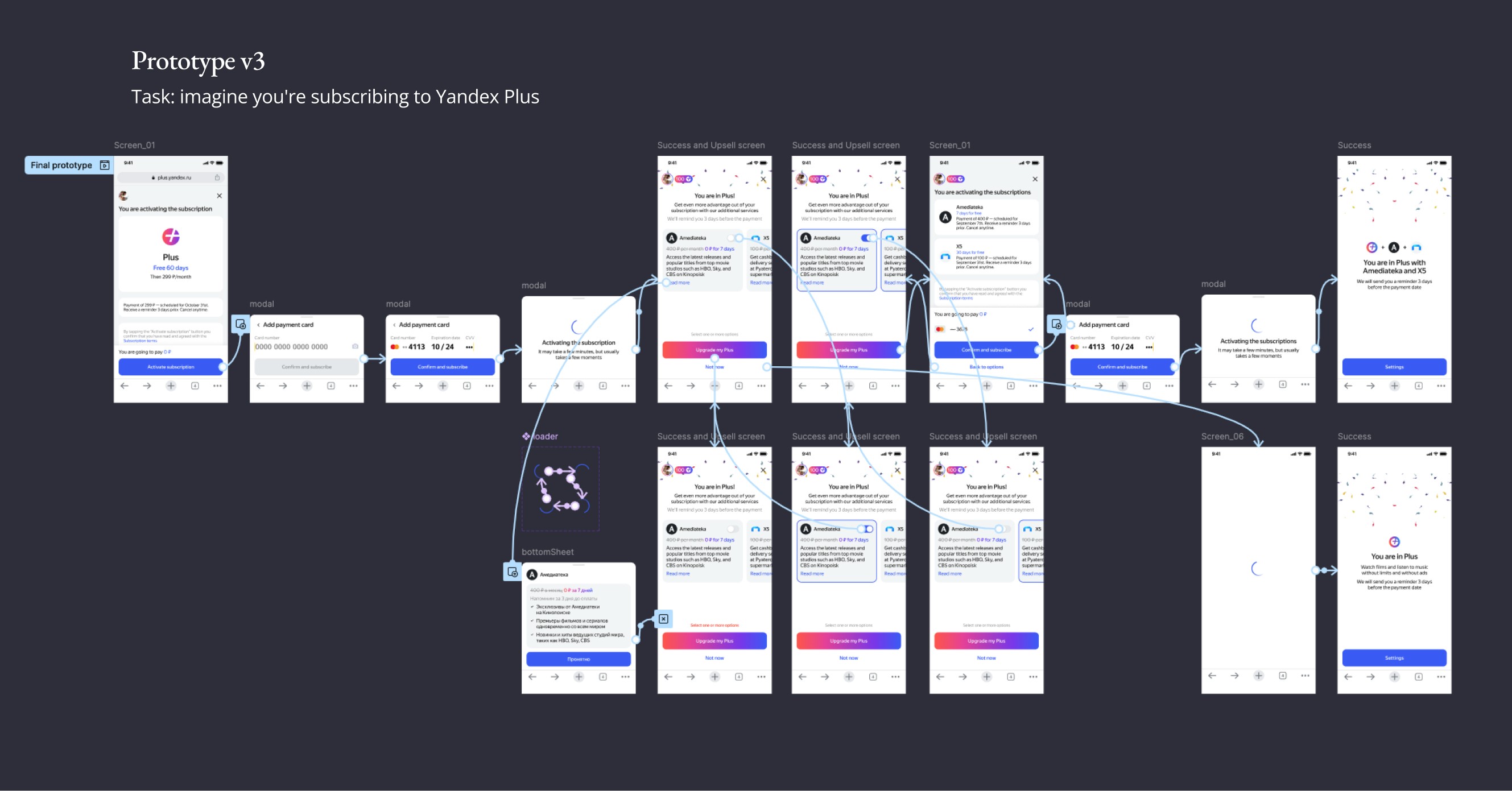
Final prototype
Feedback from Art Director
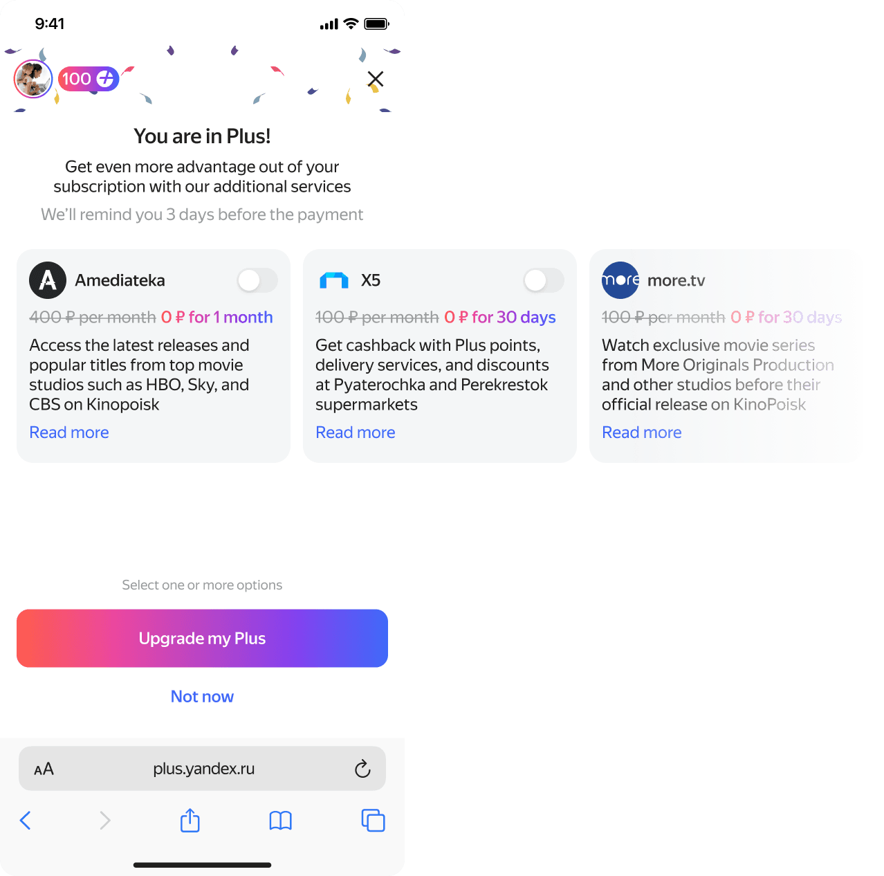
During the design review session, our Art Director suggested one correction to my design — to tone down the price text fill.
Error and edge cases
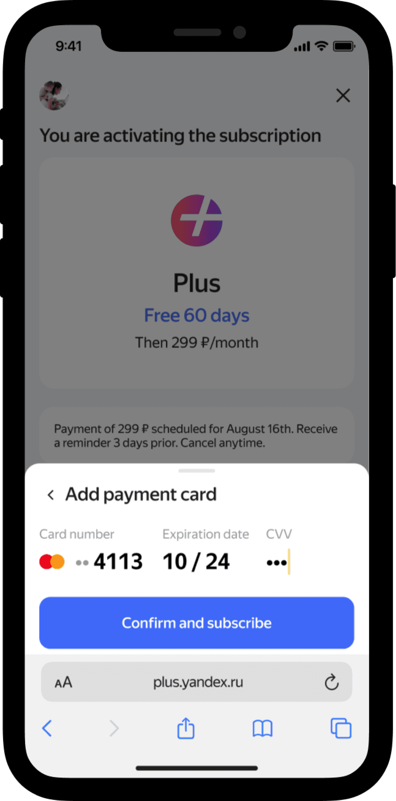
There was only one new error case to consider during implementation.
Delivery
It took us around three weeks of design iterations, prototype testing, close collaboration with PM and the team to get to a solid design proposal.
A gradual AB rollout (starting with 5% of the audience and then increasing) helped us verify and confirm that we increased the conversion to upsell rate.
Results and outcomes
The conversion to upsell rate increased by 5% boosting monthly revenue by $77K (Q4, 2023)! 🥳
Learnings
Despite the amazing result, there are some things I should’ve done better, which are:
Avoid getting too attached to your initial ideas.
Get to prototyping rapidly. It helped me uncover user needs and gain a better understanding of the problem.
